


The Arena Football League is not exactly a historic major league in the sports world. The AFL has been around since 1987 and has had a huge number of teams (many lasting less than three seasons). The league has been through a lot of ups and downs, having a season cancelled in 2009, having a boom in popularity that included a few

Denver Dynamite: 1987-1991
The Denver Dynamite were one of the
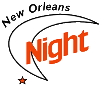
New Orleans Night: 1991-1992
The New Orleans Night played two seasons in the Arena Football League in 1991 and 1992. They had an alright first year of 4-6, but a 0-10 record their second year was all it took to kill off this franchise. As you can see, this logo looks like it represents a 24/7 fast food joint from the 70's and 80's.
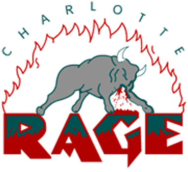
Charlotte Rage: 1992-1996
The Charlotte Rage were around for four seasons and their record was 24-36. Whats even less impressive than their record was their logo, which looks like a cheap tattoo your weird, ghetto cousin with a tattoo gun gave you. I also can't help but thing this bull needs a tissue because that is a heck of a nose bleed. But hey, at least they made the playoffs twice.
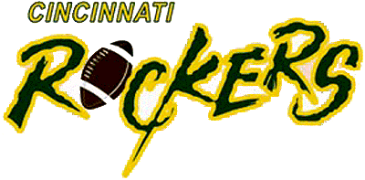
Cincinnati Rockers: 1992-1993
The Rockers didn't leave much of a legacy in two seasons in the AFL. They had a good first season, going 7-3 but a lackluster 2-10 season in 1993 solidified their doom. This logo looks like something a middle school computer class came up with for homecoming shirts. It's another clip art extraordinaire that is so bad its hard to figure out just how bad it actually is. It also doesn't help that the name "Rockers" would better be suited for a team in the city on the other side of the state of Ohio, Cleveland.

Columbus Thunderbolts: 1991; Cleveland Thunderbolts: 1992-1994
Speaking of Cleveland, check out this logo here. Not only did it get to sadly represent one Ohio city, it got to represent two. The Thunderbolts logo looks like something straight out of a football flash drive game that you played in high school classes when you were bored. The ones where you used arrow keys to move your player from one block to another. It is so generic it hurts. Ohio didn't do well on AFL logos (except for the Cleveland Gladiators, whom originated in New Jersey which explains why the logo isn't bad).
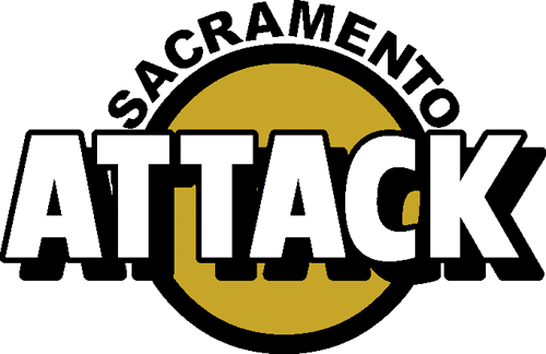
Sacramento Attack: 1992
The Attack were supposed to play in Los Angeles as the Los Angeles Wings, but that plan was changed and they played a season in Sacramento as the Attack. The only way I can justify how bad this logo is, is by making the excuse that they didn't have enough time to whip something better up. This logo is just so bad it hurts, but it hurts on so many levels you can't pinpoint where it hurts most.
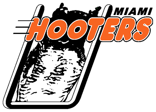
Miami Hooters: 1993-1995
After one season, the Sacramento Attack moved to Miami. The Miami franchise decided they would use a nickname that coincided with a company's marketing plan. What better company to do that with than Hooters (delightfully tacky, yet unrefined). That's right, there was once an Arena Football League team named after every middle aged man who is on a business trip in the big city's favorite restaurant. As you can see, the only alteration in the logo was the eyes. I wonder why...
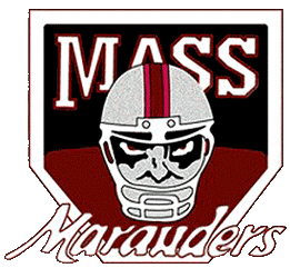
Massachusetts Marauders: 1994
Well, this looks nothing like a Marauder, just more like a football player that you would find in a 90's Nintendo video game surrounded by a home plate that had its end point ripped off. Although they went 8-4, they folded because of financial troubles. It probably doesn't help that they didn't sell much merchandise with the likes of this logo.
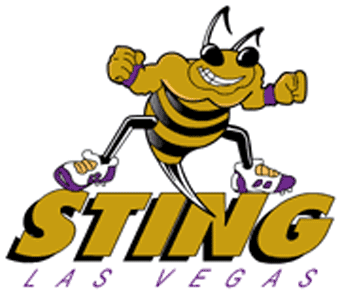
Las Vegas Sting: 1994-1995
I'm still trying to find out what this stinging insect is doing. He doesn't look comfortable. Also, the location and position of the stinger is quite questionable. Good thing Vegas had a few more cracks at the AFL to fix this disaster.

Memphis Pharaohs: 1995-1996
Here is the start of a streak of bad logos for teams established in 1995 and only played until 1996. Memphis may be the worst of the three, but you decide. It's just so lazy. It looks like a bee and a brontosaurus has a child and this is its head shot with its eyes closed. I really don't know what to make of this. It can only get better for these 1995-1996 teams, right?
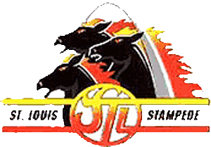
St. Louis Stampede: 1995-1996
There is a lot going on here. There are three horses that are on fire and they are passing through the Gateway Arch. It also has the graphic quality of a 25 cent comic book featuring Huckleberry Fin from the 60's or 70's. While this is much better than the last one, it is a little sad this is what they came up with in the 90's as "quality". At least they had a decent 17-11 record in two seasons.
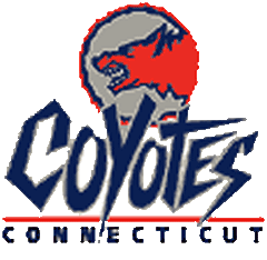
Connecticut Coyotes: 1995-1996
The last logo in the 1995-1996 collection is that of the Connecticut Coyotes. In two seasons, this franchise posted records of 1-11 and 2-12 for a whopping 3-23 all-time record. The play on the field matched the logo in how bad it truly was. The "Coyotes" font can represent their 2-12 season, because it came after some thing a bit worse, the Coyote itself which can represent the 1-11 season (something just a tad bit worse, even if you didn't think it was possible).
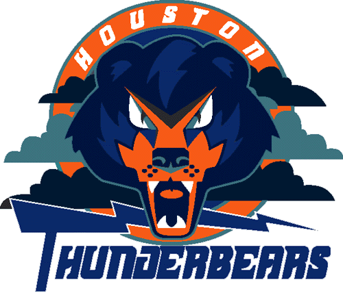
Houston Thunderbears: 1998-2001
After going 8-6 and winning their division in their first season as the Thunderbears, things went downhill for this Texas AFL franchise. Their record through four seasons was an underwhelming 18-38. In fact, they were so underwhelming that the team became a travel team in 2001, not playing a single game in Houston. The logo is also not that great, even with a pretty sweet, unique nickname. The font and the bear just aren't intimidating at all.
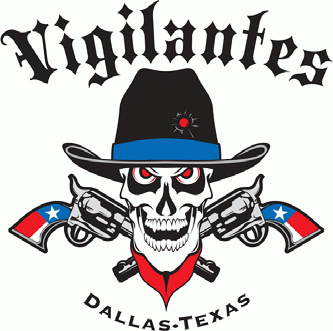
Dallas Vigilantes: 2010 (Changed in 2011 and wasn't much better)
This logo looks like it could also be seen in three other locations: on the back of a biker gang member's leather vest, on the bicep of someone who wears Confederate Flag cutoff shirts, or on the lower back of the lady who gave you a business card in a sketchy part of Las Vegas. The font and skull just aren't fit for a good logo. Next time you go to the Sturgis Bike Rally, play a game and see if this is inked on someone or sewn on their outfit.
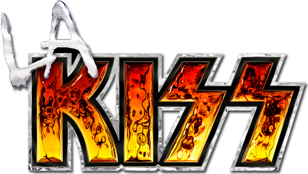
Los Angeles Kiss: 2014-2016
When members of Kiss Paul Stanley and Gene Simmons started an AFL team, you had to guess they would be named the Kiss and use their logo. The Kiss were known for having quite a show go on at the Honda Center with vibrant uniforms, silver turf and scantily clad ladies dancing everywhere. That doesn't hide the fact this logo is awful. This Kiss logo is a classic in the rock and roll industry, but with the lazy "LA" added to it in that atrocious font makes this hard to like. It looks more fit for a radio station than a football team. Any logo that involves a brand already solidified will almost automatically go in the "not so great" bin. Just look at the Miami Hooters. To be fair, if you added Hooters and Kiss together you would have one heck of a night. Just not seperately and representing Arena Football League teams.
And that was a little taste of how bad the Arena Football League has done with the branding of their teams. While I tried to pick out the worst ones, there are still plenty of bad ones out there. A simple google search will help reveal even more questionable works for your enjoyment.