


Style is something I’ve always found interesting when it comes to animated works. I feel a style can greatly impact how a show presents its animation, humor or themes. When I was a kid, I would turn on the television to watch my favorite cartoons and see the goofy, loose style of classic "Looney Tunes." Or the darker, more tightly-defined models of action cartoons, such as "Batman: The Animated Series." The 90s was the apex of all this: you could watch all these different cartoons with different styles that were meant to be accessible to different audiences. One thing that was big in the 90s, though, were UGLY cartoons.
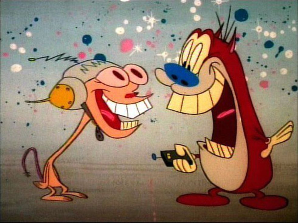
You know the ones: weird facial expressions, more off-the-wall movements and trying their best to not be constricted by the animation rules of yesteryear. One of the most well-known examples of this back in the ‘90s was John Kricfalusi’s “The Ren & Stimpy Show,” one of the original Nicktoons. Cartoons were coming off the rigidness of the 80s, which was filled with cartoons based on toys or games. It was refreshing to see original content that wasn’t trying to get you to buy something. And with that freedom, something new was born.
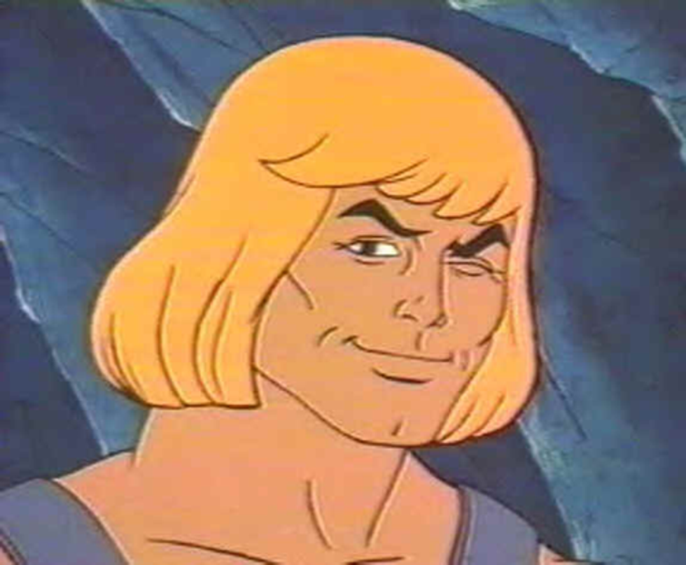
Back in the ‘80s, it didn’t matter how good the show looked; what mattered is that it sold toys. That’s why you got stuff like “He-Man” and “Thundercats,” with their barely-moving bodies and flat colors. The ‘90s changed all that. Creators began to take more control of what they produced. It wasn’t about trying to sell a toy or video game, it was about trying to create a cartoon for the sake of creating a cartoon!
And with that, a whole new world of freedom was granted to creators. A person could pitch a cartoon without it being tied to something. John K was one of the pioneers who took advantage of this: “Ren & Stimpy” was unique in how off-model and strange it was. Ugly animation existed before this point (take a look at the work of Ralph Bakshi, by whom John K. was inspired), but it was certainly popularized by “Ren & Stimpy.” This trend was continued by an animation studio named Klasky-Csupo. Klasky-Csupo is mainly known for their flagship cartoon, “Rugrats.” It aired around the same time as “Ren & Stimpy,” but definitely was nowhere near as outlandish as its fellow Nicktoon

Though that’s not to say "Rugrats" didn’t have some weird design choices. Animator Peter Chung (of “Aeon Flux” fame), who worked on the pilot, made sure to implement strange camera angles to make the audience feel small, just like a baby. The adults looked strange and oblong, to accentuate the fact that adults can appear mysterious or even scary to children. The weirdness continued with Klasky-Csupo until “Aaaah! Real Monsters.” I was never a huge fan of the show, but it definitely had a strange charm. It was a show about monsters, after all. Everything had these faded and bleak colors. It made everything feel strange and eerie.
Then Klasky-Csupo made other shows like “Rocket Power” and “As Told By Ginger” that continued the style of Rugrats. That’s where I felt their visual style started to become pointless. It’s important with any work of animation that the visual style presented match the tone it’s going for. Shows like “Rugrats” and the lesser-known “Duckman” were shows with a lot of weird scenarios and off-beat humor. “Rocket Power,” ”As Told By Ginger,” and other similar shows were more grounded in reality; they were essentially slice-of-life shows. There was no particular reason for them to be drawn in such unusual styles, other than because it was Klasky-Csupo’s trademark at that point.
There are plenty of shows that effectively use its crude style to make a point. “Beavis and Butthead” used messy, ugly character designs to make a statement about American youth at the time, and the style of humor was carried by its art. “South Park” used the snappy motion of its construction paper world to match the snappy jokes delivered by the show’s characters. All of it’s very deliberate and it makes the writing more apparent to the viewer. Then the 2000s came around and began to blur the lines. Television animation was now becoming cleaner and more brightly-colored, thanks to the influence of shows such as “Powerpuff Girls” and “Dexter’s Laboratory,” both of which used high-stylized and dynamic animation with simpler designs and movements.
These shows felt more graphically-oriented. Another factor was the popularity of anime in the West, which began to surface in the late ‘80s and early ‘90s. Anime is more typically known for having a cleaner, more uniform work, which began to influence how creators in the West created animation. The advent of digital software also spurred this change. It was much easier and cost-effective to animate characters composed of graphic shapes rather than try to draw characters like you would with pencil and paper. There’s even an animation style known as puppet animation (not to be confused with actual puppets) where characters are composed of multiple moving parts and animated in digital programs such as Adobe Flash or Toon Boom.
Another reason for this shift is television animation’s increasing popularity during that period. The ‘90s were a period of television cartoons finding their footing, so a variety of styles were explored from different creators. As shows became popular, like the aforementioned “Powerpuff Girls,” which was a massive success for Cartoon Network, imitators began to pop up. This certainly isn’t unique to television — one needs to only look at the majority of non-Disney animated films — but it was noticeable when several shows began to move in this cleaner, more graphically-minded set standard. As with the early ‘90s, a new paradigm was set for creators and companies alike to follow, leaving ugly cartoons somewhat stigmatized by the public.
This has led to this (admittedly not new) idea that an “ugly” cartoon is not worth watching because a person doesn’t find it visually appealing. Of course, that’s entirely down to taste, but I feel there’s a difference between “ugly” and “visually unappealing.” I think Cartoon Network’s “Ed, Edd n’ Eddy” is an ugly show. But I do not think it is a visually unappealing show. Appeal, in animation, is the concept that a character is visually appealing to us for whatever reason. This often boils down to the design choices made. Look at Mickey Mouse:
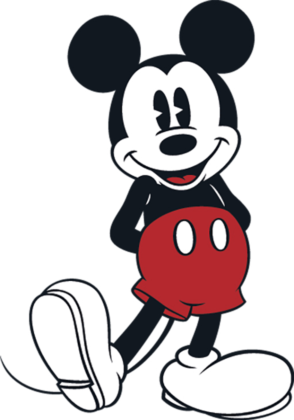
He’s happy, expressive, and full of simple shapes that give him a very simple silhouette. He is considered to be one of the pinnacles of character appeal, if not the pinnacle. Often people assume this is because Mickey is a cute character, which certainly helps. But I think considering Mickey’s appeal comes from how cute he is is a giant disservice to his design. Mickey doesn’t have appeal because he’s cute: Mickey has appeal because he’s simple. There are no extraneous design elements to confuse the audience, so it’s very easy to quickly understand and like Mickey. By that merit, I would consider Eddy from “Ed, Edd n’ Eddy” to have just as much visual appeal as he does.
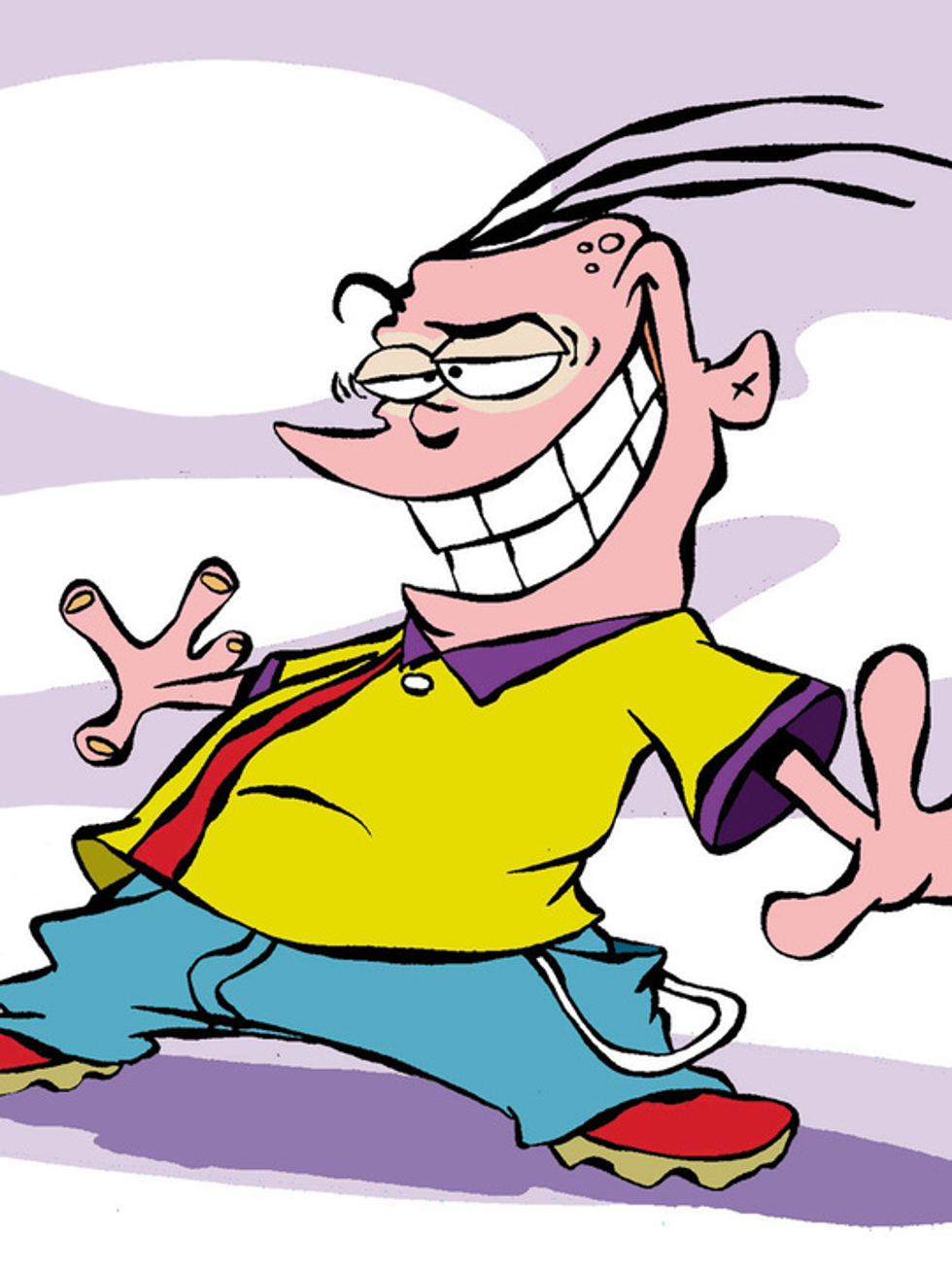
Eddy is short, tackily dressed, and has a mouth that takes up most of his face. He’s a conniving loudmouth and everything about his design communicates that to the audience. I don’t like Eddy’s design because I consider him cute; I like it because, just like Mickey’s, it’s deceptively simple. All this is to say that what people might find visually appealing wildly varies, but just because something appears “ugly” doesn’t mean it lacks appeal. It’s up to you as an the audience to figure out for yourself what makes a design work and what doesn’t. Which is exactly why I find ugly cartoons so interesting. They can’t rely on being cute, so they have to rely on smart character and setting design to communicate to the audience what it wants to communicate.