

It’s that time that of the year, again. Pantone announces their color of the year. If you’re not interested in color, or you're not a design student, then you might not know that the Pantone Color Institute is responsible for creating a color matching system for designers to know how their colors will look printed. And every year, they announce a new color of the year, which you’ll undoubtedly see all around you in stores year round. The 2015 color was marsala. It was a deep red wine meant to be flattering to everyone, dramatic, grounding, and glamorous.
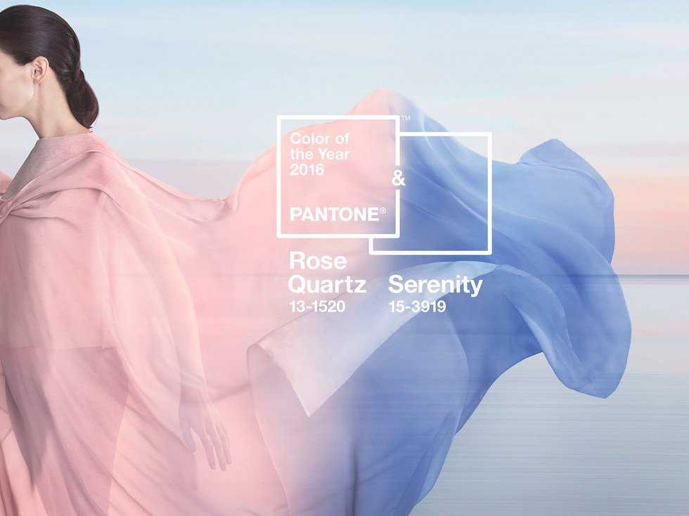
This year, there are two colors: rose quartz and serenity.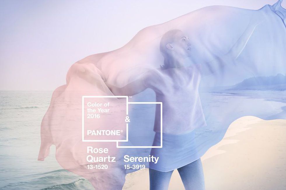
Rose quartz is a light, rosy pink, while serenity is a cooler, light blue.
What's the point of choosing two colors to be their color of the year? To represent the blur of gender in fashion, and to represent the movement towards gender equality and fluidity. They are also hoping to challenge traditional associations with these two colors.
It’s admirable that a company whose impact is seen subtly everywhere in fashion is trying to help spread a good message. Yet, there’s potential that this message will fail. Pantone is hoping to break the barriers with their colors of the year and take away from the association of pink for girls and blue for boys.
However, there’s the threat of the color divide spreading even further with the two separate colors. Although their color announcement video shows an arrangement of the colors being intermixed and blurred together, there’s no guarantee that designers will make use of these blended colors.
Then, there is the topic of the two colors. A Wired article by Liz Stinson makes the point that Pantone could have achieved the same effect by simply choosing a neutral color. Marsala was marketed as a color that appeals to both men and women, equally. Rose quartz and serenity are supposed to be the blur between genders, so why not just blur the colors. The purple mix of the two colors could have been as effective for the company and their message.
This is the first time Pantone has chosen a more social message to represent their color. Past colors have been chosen based on the feelings they evoke, inducing energy or imagination. Yet, these 2016 colors are meant to create connection and peace. This is a good message, but not the norm.
It’s a big step in itself for a company like Pantone to forgo what might be more popular in high-energy color. They are also choosing to make their colors the foray for discussion and change. Pantone wants to change our gender perception and the way we think. They want us to find peace and connect with each other. But will it even do anything?
Though you're sure to be seeing these colors everywhere in the New Year, it might not be as impactful as you think. Is your serenity colored dress going to blur the way you think about gender? Maybe not. The message is great and it’s nice to see a company taking a stand on gender and social issues, but at the end of the day, colors are colors. Hopefully, some change will come, but either way, we’ll be seeing a lot of rose quartz and serenity in 2016.