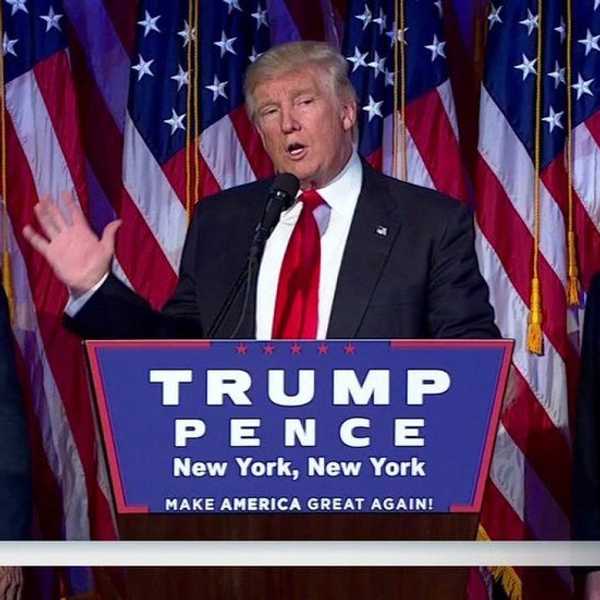


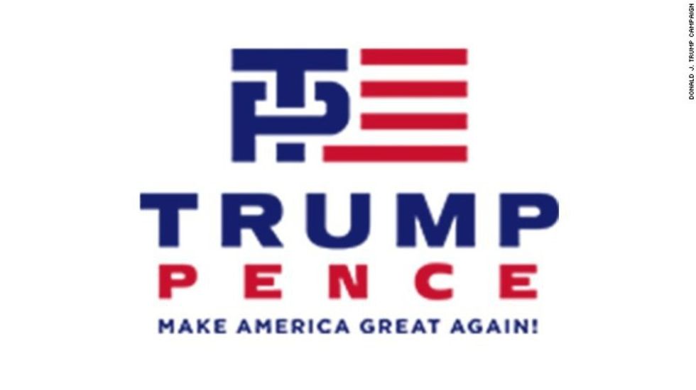
Amidst all the terrible news of this week (military coup in Turkey, terrorist attacks around the world, “honor killing” of Pakistani social media star, to name a few), Trump decides to chip in to collective human misery through announcing his pick for VP—Mike Pence, Governor of Indiana, notorious for his extreme stance on immigration, abortion, birthright, education and foreign policy. After a passionate speech, Trump presents Pence to the world, drops a new campaign logo on Twitter. Meanwhile Ben Carson cries in the corner at his broken president and vice-president dream, and my hope for this election dropping harder than the British Pound after Brexit.
The imagery of the Trump-Pence logo was quite…penetrative (I’ll see myself out), and Twitter quickly responded with sarcastic comments, memes and even gifs. While many pointed to the obvious sexual connotations evident in the interlocking letters of “T” and “P,” symbolizing either Trump screwing the country over, or a literal Republican circle-jerk, I could not help noticing the scatological imagery—Pence’s “P” being a fine toilet lid, while the acronym “TP” points to “toilet paper,” analogous to Trump’s failed business initiatives.
Suggestive extraordinaire.
I suppose Sigmund Freud may be jumping with joy in his grave, poor man.
Leaving the fascinating visualization of America being screwed over aside, let’s start from the names of the two candidates, spelled out directly below the flag. Both names are rendered in sans-serif bold font, in all-capital letters, which is not rare in presidential logos; what is more intriguing is the literal visual rendering of Trump’s bloating ego. I pity the poor graphic designer who had to magnify Trump’s name to that dimension while sacrificing perhaps every single principle learnt in art school; just like his ego and his big mouth, the letters are bold, thick, bloated, stocky and exert such dominance that the graphic designer had to stretch Pence’s name to ridiculous proportions. The kerning in Pence’s name is so ludicrous that you could literally also fit Carson’s name in between every letter, and it would still be easier on the eye. It also looks like the entire logo might topple over and fall apart—Trump’s aggrandized arrogance floating above Pence’s overstretched frame, which in turn balances meticulously on a much tinier string of empty promise—“Make American Great Again!” Make American fall apart again?
Moving on to the graphic logo that Twitter had so much fun with. As an international student, I have been in the US for less than three years, but even I can tell, upon my first glance, that this is clearly not a correct depiction of the flag of the United States. In which American flag, anywhere in the States, do you see the blue rectangle taking up almost half of the flag? With one red stripe very uncomfortably sticking out at the bottom, throwing your viewer off balance—is that your orange hair, Donald? Did you drop your toupee? One could also not help but wonder at the visual dominance of the initials over the American flag, swollen and loud and drowning out the rest of America—and, between the two letters, the “T” stretching a third longer than the “P.” Of course, this is a clear indication of the who the boss is; it could also be a subtle hint at Trump’s sartorial habit of wearing long ties, or even a reminder of Trump’s remarks at the Republican presidential candidates’ debate about the length of his fingers and his—oh wait, never mind.
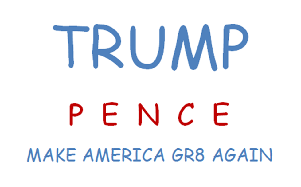
For inexplicable reasons, the logo disappeared almost as soon as it appeared, thus denying Internet users four more months of sordid laughs in the face of sheer misery. The new logo is unimaginative at best and horrendous at worst. It merely contains the two candidates’ names, clearly cropped from the previous logo, again with Trump’s swollen ego balancing perilously on top of bad kerning, much like his promises for the country—porous, dangerous and just ugly.
One thing is certain though, if Trump and Pence enter the White House after November, then, just like the logo, America is f*cked.
See? Graphic design is my passion.