
I've begun noticing how posters and cover art for various forms of art (such as films and video games) have taken a dive in overall quality. Rather than the unique hand-drawn designs of the past, most posters are just simple Photoshop edits with little to no attempt at standing out or being memorable. Within the last decade, with only a few exceptions, no poster has stuck out to me. I'm not saying all of these posters were bad; in fact, most are quite passable. However, that's the problem, they're just passable. They do the job of advertising the movie, but you forget about the poster within days of having seen the movie. This article will present great examples of posters (past and present) and why I think poster quality has been going down the drain..
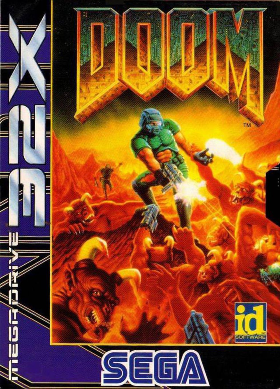
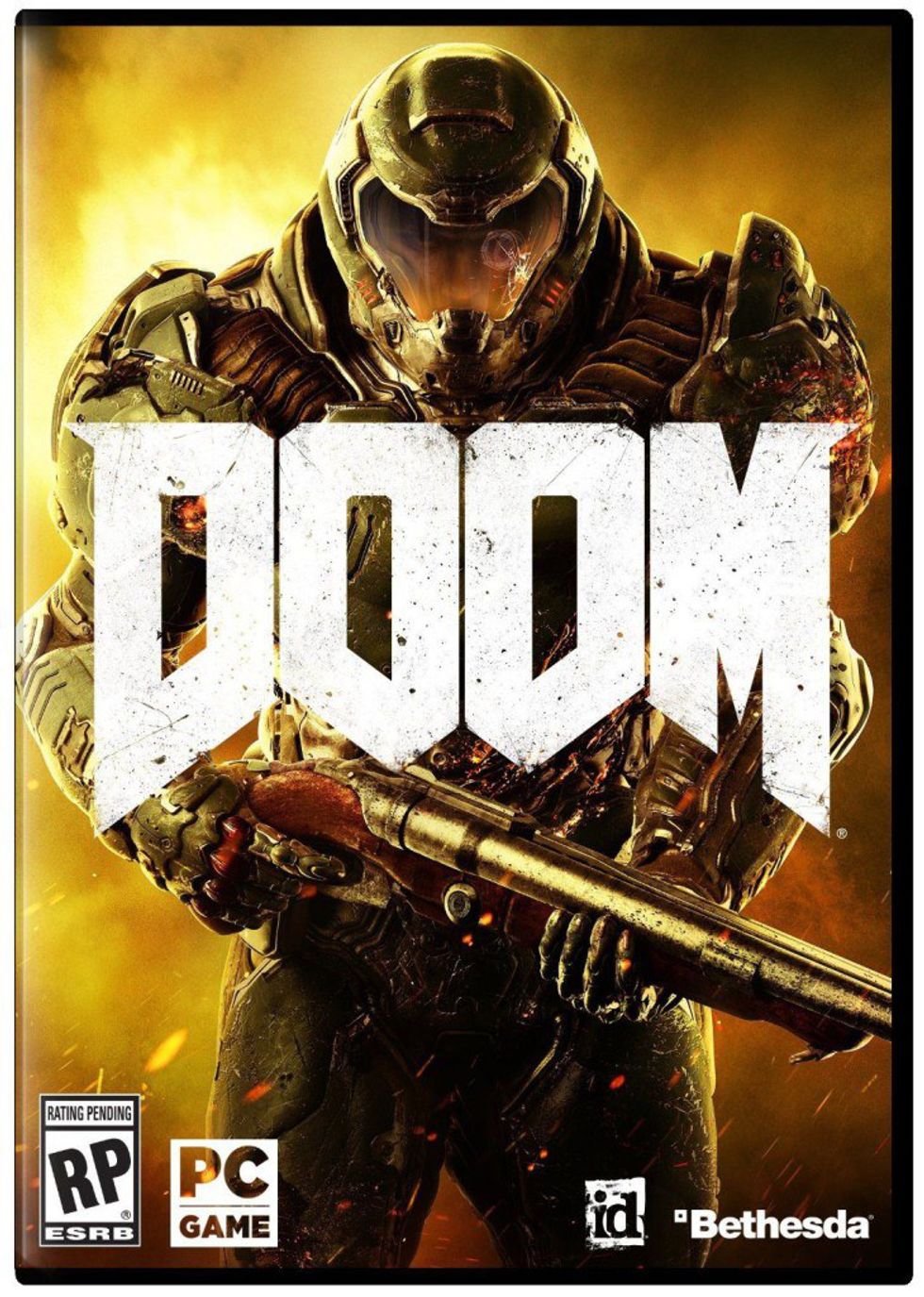
In my opinion, no example shows how far posters/covers have fallen in quality than the cover for the excellent video game "Doom" (2016). The games of the "Doom" franchise are known for having several well-made, handcrafted covers for their games. The art style reflects the hand-painted heavy metal album covers that were quite common in the 1980s. Then you look at the cover art for the most recent game and it's the most generic video games cover ever -- just the "Doom Marine" facing the front, no background, no face, just holding a gun.
This style of cover is so uninspired and overused (seriously! look at any cover for a First Person Shooter game, almost 95 percent of them have a cover that's just an emotionless soldier holding a gun). This cover art was so generic that it spawned a meme and eventually the publisher Bethesda released an alternate cover for the game (which looks amazing). The generic cover art for this game is the embodiment of everything wrong with modern posters/cover art.
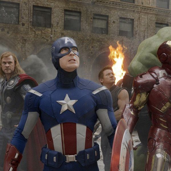
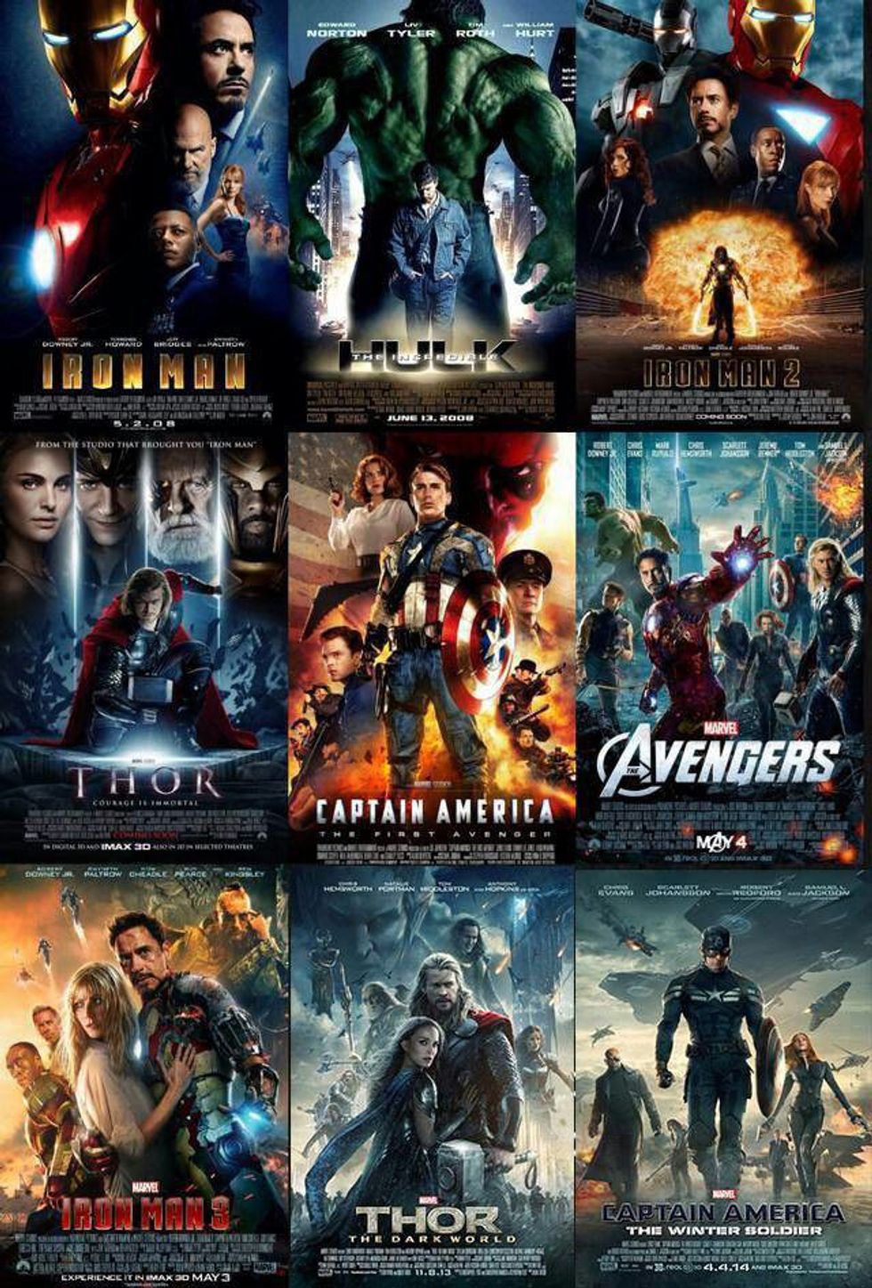
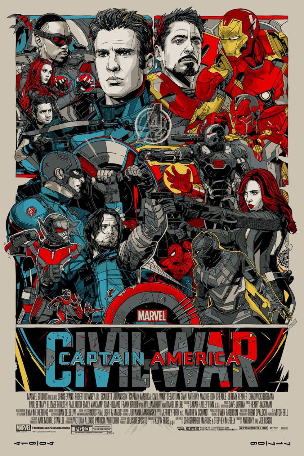
The "character just standing in the center with a blank expression" style is not unique to video games. Many films have used this style to death. I love "The Avengers" films and the rest of the Marvel Cinematic Universe films to one degree or another, but they are the poster child (no pun intended... well?... OK, pun intended) for everything wrong with movie posters. It's just the main characters who look obviously Photoshopped in, giving blank stairs, sometimes with little to no background, and often in teal and orange hues (Hollywood loves those two colors).
While I love most of these films ("Iron Man 2" was just OK), I can tell that no love went into crafting the poster. This is especially disappointing when you see other artists making better posters than you. the artist Paolo Rivera created alternate posters for the "Captain America" films that are not only beautifully painted but also reflect the pulpy adventure poster style of the 1940s. The website Mondo sells unique film posters that very stylized, detailed, and display unique color patters. It's a shame that Marvel, a company that has comic book artists at their disposal, is constantly shown up by third-party, independent artists (and if you think I am just getting mad at Marvel, you should know DC is just as guilty).
I've spent most of the time talking about the mediocre state of posters, but I haven't discussed why this is happening. While I don't have any solid evidence, I do some theories. First, I feel like technology has impacted poster/cover art in a big way. Most of the older posters were hand-painted because that was all they had at the time.
Now, Photoshop has become the dominant tool when it comes to poster creation. While Photoshop can be useful in design, it just can't match the hand crafted quality of the older painted one. I know that sounds a bit snobby, but I just have a better appreciation for what the artist had to go through to make the painted ones. That's not to say you can't make great poster designs using Photoshop, the "John Wick: Chapter 2" posters are good examples of being creative with the tool, but I see it done so rarely.
The second theory I propose is that most poster makes don't try as hard because they don't need to sell the film to the audience. We live in the era of the internet and YouTube. I remember back when trailers for films could only be seen in the theater and most of the marketing hype was generated through posters that caught the audiences' eye and made them interested in seeing the film.
Now people can watch trailers and ads for a film on YouTube whenever they want to, so the need for a poster to create hype and buzz has lessened dramatically. This lack of effort could also be explained by the fact that most of the films they're advertising (nostalgic properties that already have a large established fan-base) don't need to try as hard to draw audiences into the theaters. The original "Star Wars" posters had to be colorful and unique because it was an original film that the studios had to generate hype for.
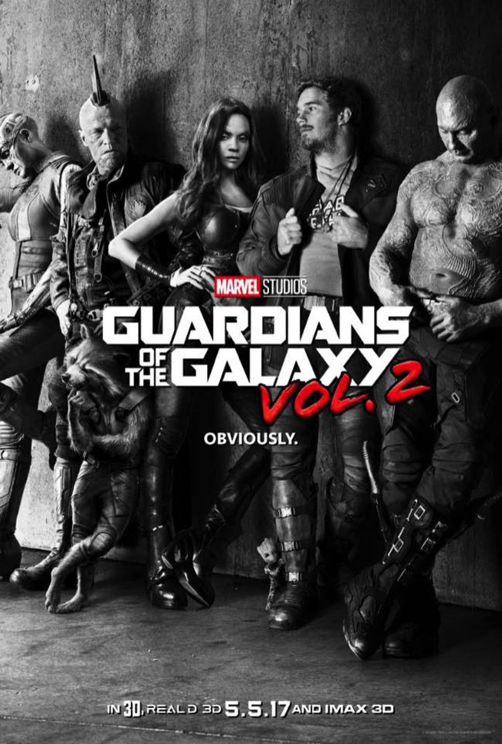
Despite everything I've just said there are still examples of quality, unique movie posters out there. The reason I chose to write about this topic was due to the "Guardians of the Galaxy Vol. 2" posters that were released. These are inspired works that really got me excited for the film. The first one has the characters leaning against a wall in black and white with deep shadows. I love how this poster resembles an indie rock album from the '70s.
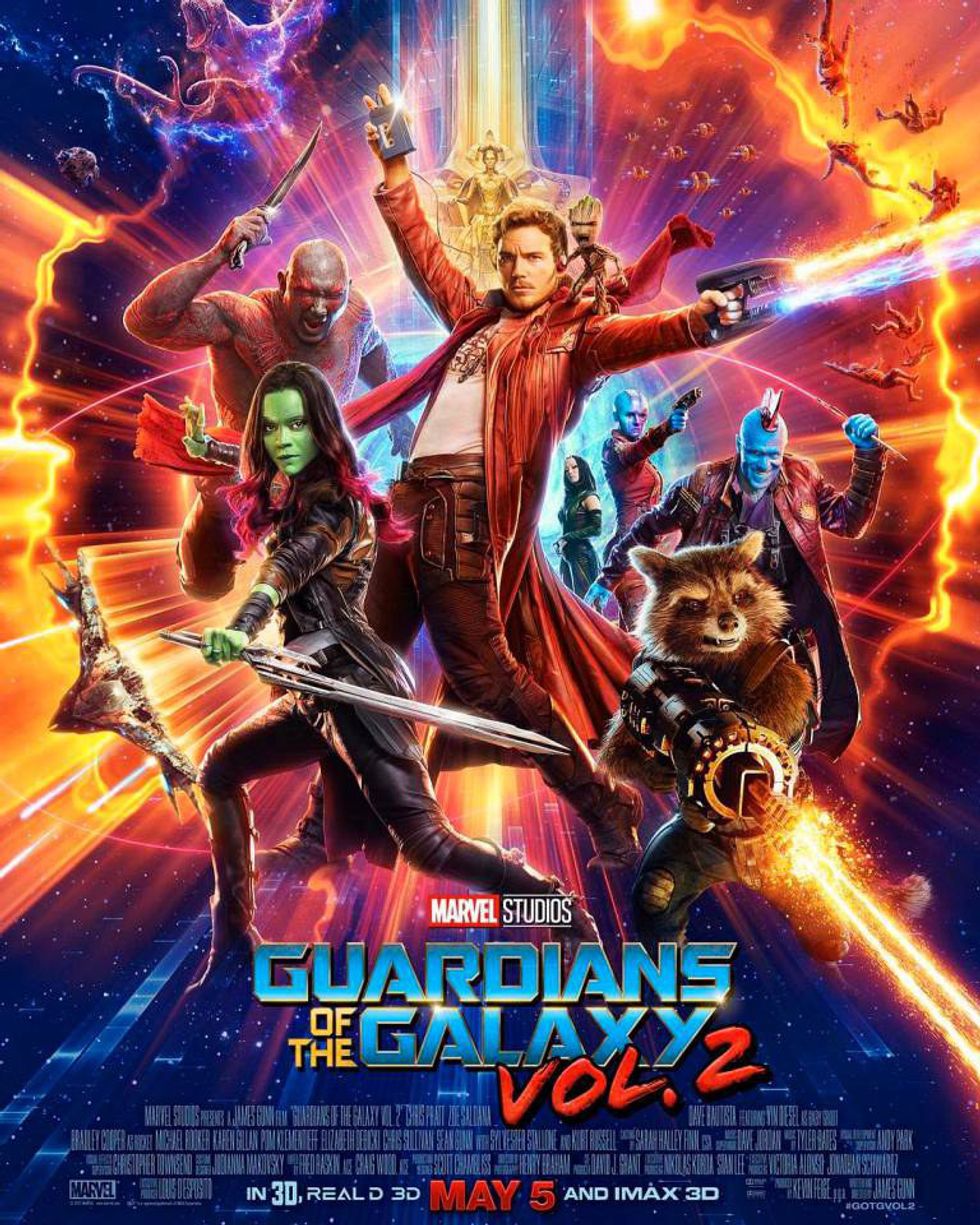
It really presents the characters as larger than life rock stars. The second poster is great just due to it being cheesy, colorful, and fun looking. I also love the rich level of detail and "things" within the poster; it really hearkens back to styles used by the pulpy science fiction serials that helped inspire the poster art for "Star Wars" and "Flash Gordon."
Plus the reference to "Saturday Night Fever" is pretty funny. In fact, it was my love of these posters that made me realize how I rarely see film posters that draw my attention and make me feel appreciation for it (to the point where I want it hanging on my wall). Hopefully, one day, poster/cover art can be viewed as an art form in and of itself, that way more respect and care can be given to the posters of some of our favorite films. The quality of the poster should reflect the quality of the film.