
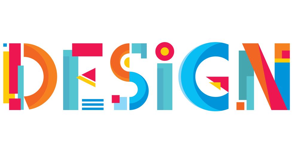
ELEMENT: Within the text, individual elements create meaning for the text. These are made by words, shapes, colors and phases.

The image above shows an element because it makes an individual object the emphasis for the story of the text. The words make this story even more meaningful, because it allows the viewer to understand why there is a piece of paper on a pole.
EMPHASIS: Puts stress on specific elements to highlight the importance of it with color, placement and size.
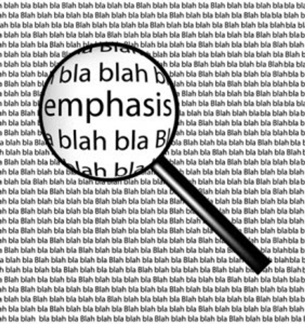
The image above shows emphasis by the size and contrast. The size of the text is bigger than the text in the background mostly to emphasize the text and its content. There is also more visible white than the background to emphasize the word more.
CONTRAST: The difference between elements so that the combination of those elements makes one element stand out from another.
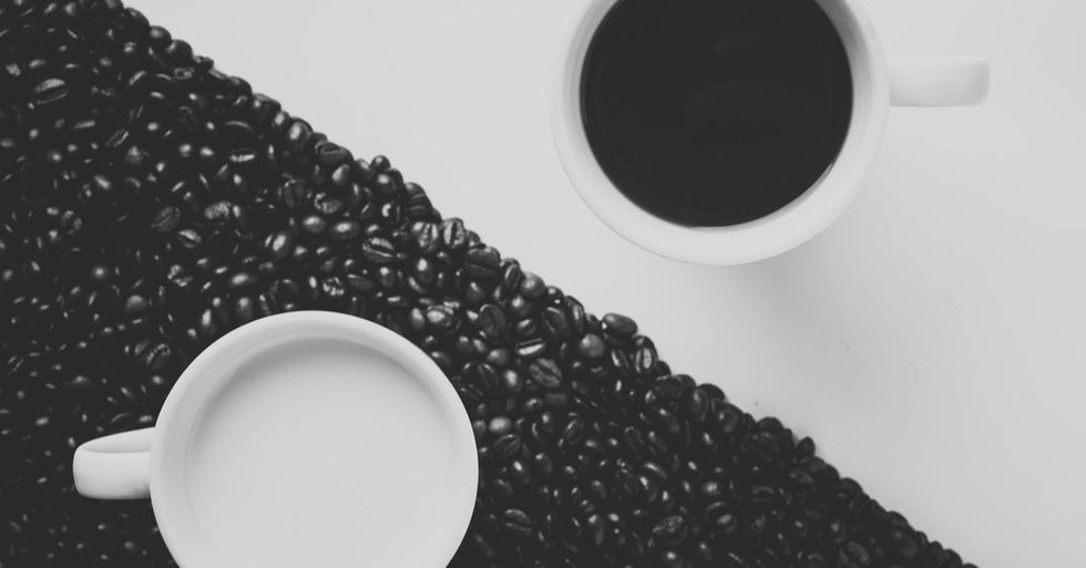
The image above shows contrast by color and placement. The colors are black and white which shows the separation within the text. The placement of were the cups are creates another layer of contrast within the same colors of the background.
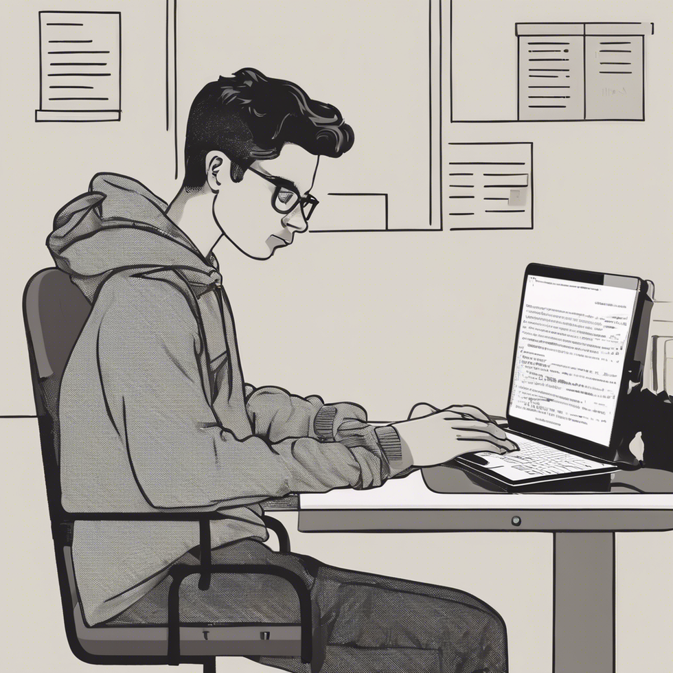
ORGANIZATION: The way in which elements are arranged to form a coherent unit or functioning whole. (size, color, placement, etc.)

The image above shows organization by placement and size. The placement for this scene is more about what works best for the worker at the desk. The keypad will come first so they are able to reach and type effectively and the screen will always be in the back so it is visible.
ALIGNMENT: The line up of text: meaning how your eyes move across the text provided.
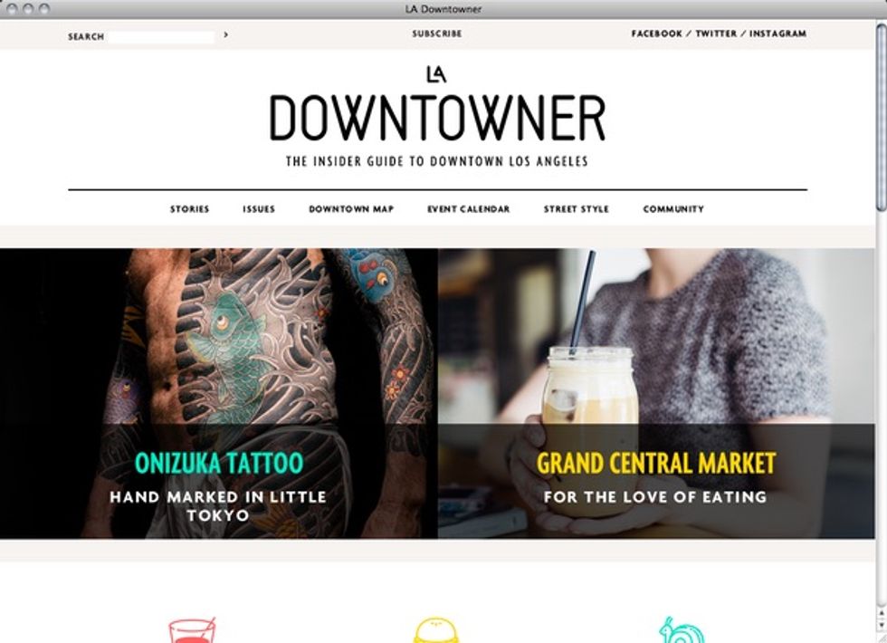
For the website above alignment is shown by the separation of two images in the middle of the text. it is still read from left to right and top to bottom. The two images in the center gives us the ability to look around the text.
PROXIMITY: Closeness in space: How close the elements are from one to another. The result of relationships due to the spacing.

The image above shows proximity because the letters are all really close to each other to form words and the other words are close to the others to form sentences. Therefore, building relationships within the text. The letters in the background are distant from the ones in the center, showing that they are not part of the text.
COLOR: Determines emphasis in a visual text, this doesn't just mean the color itself but how big or bold or even how much contrast there is throughout the text.

The image above shows color because it has two different shades of blue, but one is very vivid and the other is dull. The tent is bold and it's emphasized throughout the text. The sky on the other hand is dark meaning that it is night time, therefore telling the viewer a story by the color that is shown.
FRAMING: Literal frames vs. sight lines: Literal frames are pictures, windows, etc. Sight lines are drawing our focus without the actual frame. These frames help us draw focus on certain parts of the text.
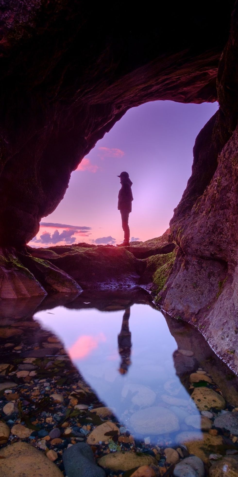
The image above shows framing by giving us a sight line. The cave that the man is in is creating a frame that allows for the man in the picture to be emphasized. There is also a frame that not a lot of people would see, the frame that the water on the ground forms is also emphasizing the man from the reflection the water forms.
SEQUENCE: The order in which a series of actions, events, words, or images occur or are shown to create a story within the text.
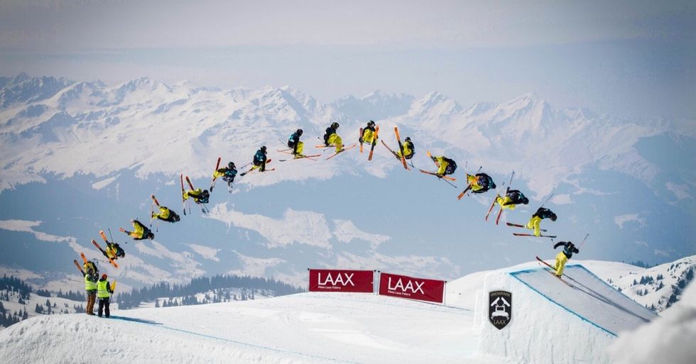
The image above shows sequence by showing us several images/scenes of a man skiing and doing tricks in mid-air before he lands his jump. This text tells us a story by the actions and movements throughout the text. These movements allowed us to know that he landed his jump successfully.
 people sitting on chair in front of computer

 all stars lol GIF by Lifetime
 two women talking while looking at laptop computerPhoto by
 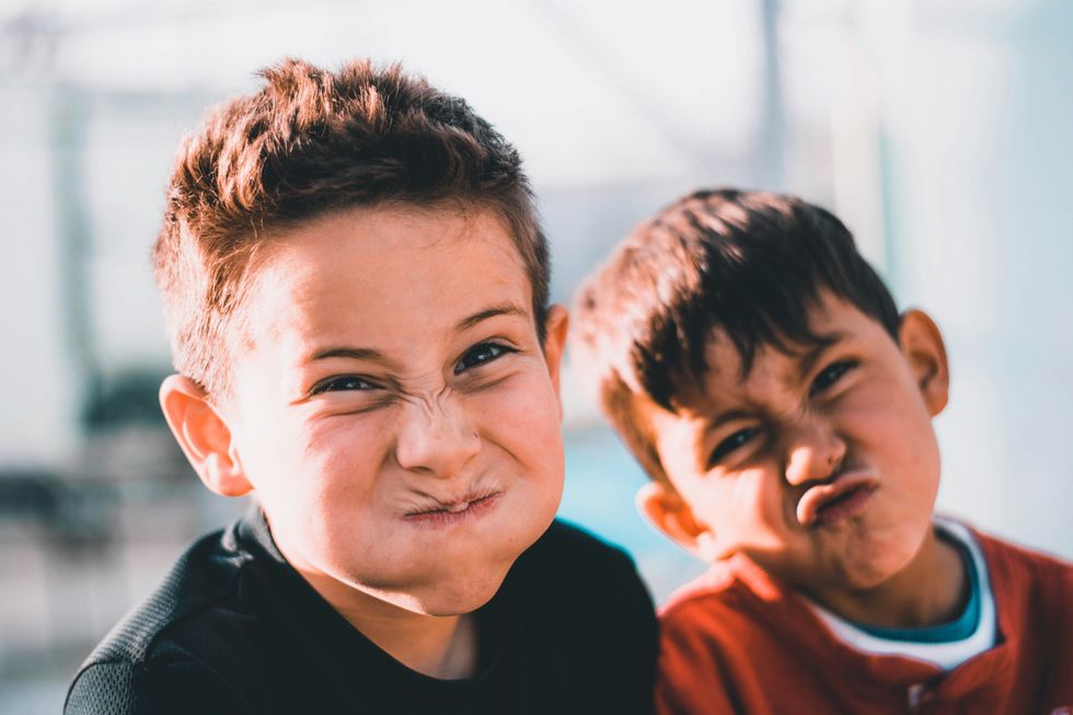 shallow focus photography of two boys doing wacky facesPhoto by
 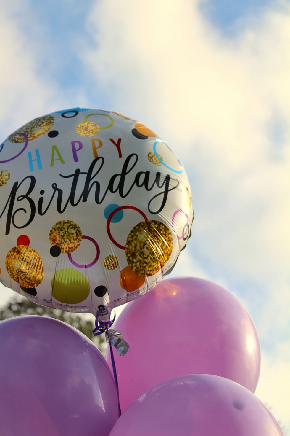 happy birthday balloons with happy birthday textPhoto by
 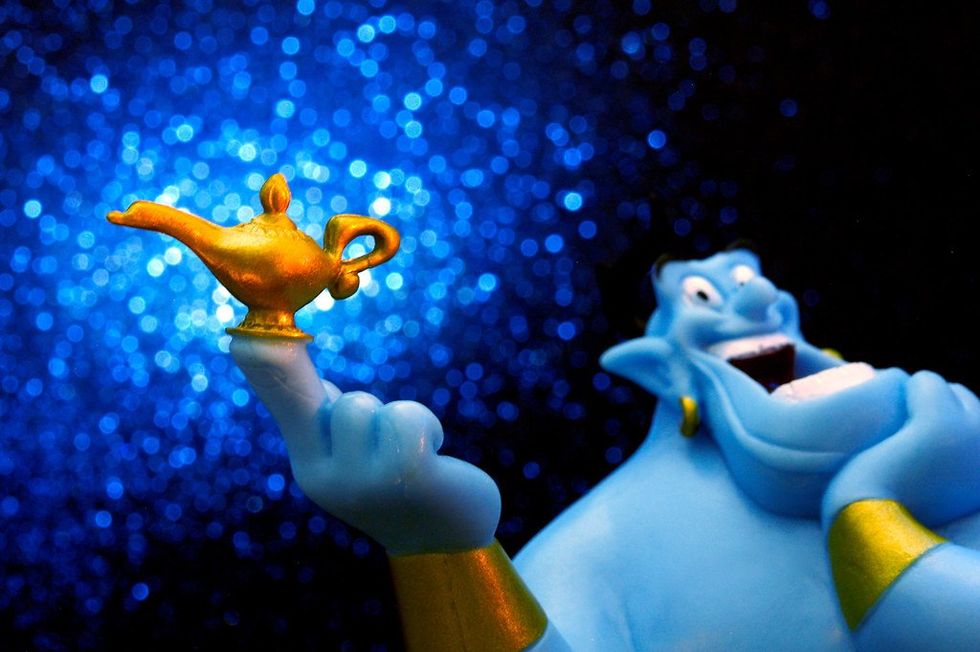 itty-bitty living space." | The Genie shows Aladdin how… | Flickr
 shallow focus photography of dog and catPhoto by
 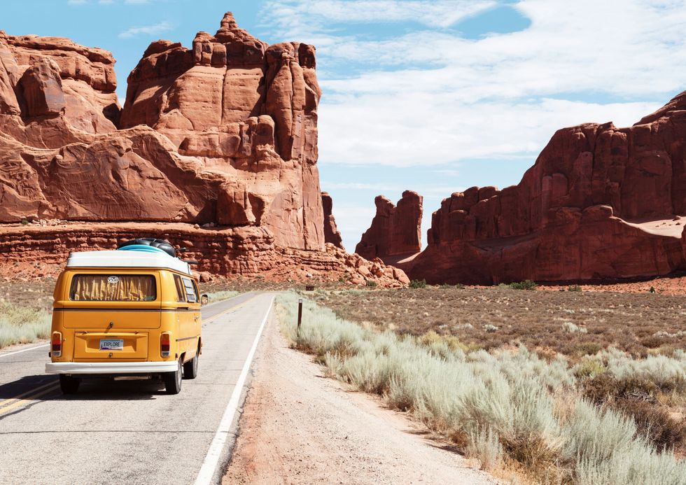 yellow Volkswagen van on roadPhoto by
 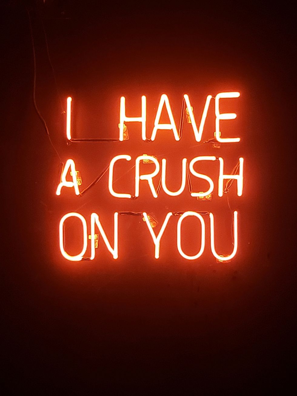 orange i have a crush on you neon light signagePhoto by
 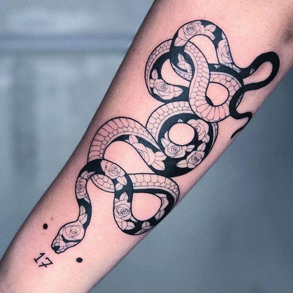 5 Tattoos Artist That Will Make You Want A Tattoo
 woman biting pencil while sitting on chair in front of computer during daytimePhoto by
 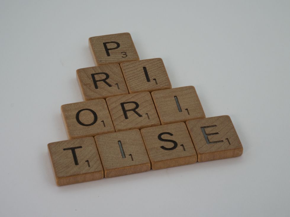 a scrabbled wooden block spelling the word prizePhoto by
 StableDiffusion
 StableDiffusion
 StableDiffusion

 women sitting on rock near body of waterPhoto by
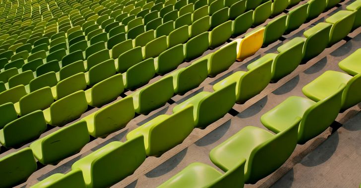 Photo by
 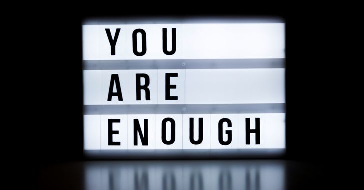 Photo by
  Photo by
  Photo by
  Photo by
 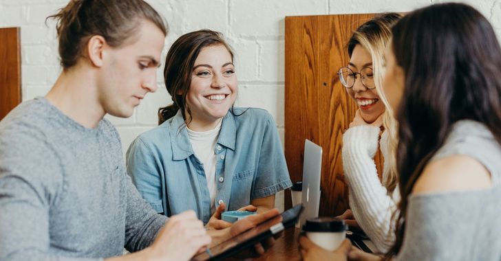 Photo by
 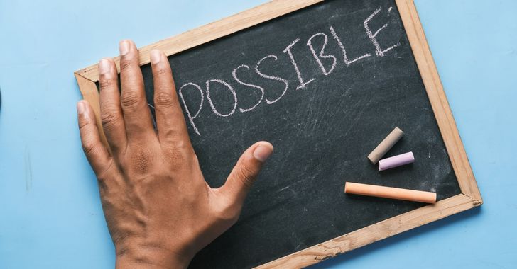 Photo by
  Photo by
  Photo by
  Photo by


