


Let’s talk red cups. No, not the plastic ones you strategically placed in your early high school Facebook pictures. The latest controversy circles around Starbucks’ change on their classic Holiday Cups.
Facts:
#MerryChristmasStarbucks. Seen the hashtag? Or the fire back, #ItsJustACup. Social media allows everyone to voice their opinion. Right, or wrong, it’s an outlet for the way they see it, to be heard. The latest buzz relating to Starbucks isn’t over their PSL’s or even the minty deliciousness of their seasonal cake pops. What the customer community has harsh feelings over is the stripping of the company’s holiday cup design, which differs from year to year. Below is 2013’s design, a frenzy of gold and silver ornament-like shapes, and last year’s combination of different hued reds brushed around the cup. So you’re thinking, “Okay, so what?” Many are actually disgusted with the simple wiping of the decoration on the cups. Making them just red, the company is accused of stripping the Christmas holiday from their brand.
Joshua Feuerstein, an Arizona-based evangelist, posted a video on November 5th, accusing the coffee giant of removing the Christmas pattern because the company “hates Jesus.” The video has over 15 million plays on YouTube and has been discussed on all news platforms. "Do you realize that Starbucks wanted to take Christ and Christmas off of their brand new cups," Feuerstein said, "that's why they're just plain red."
2013

2014

2015

My Ultra Confused Rebuttal:
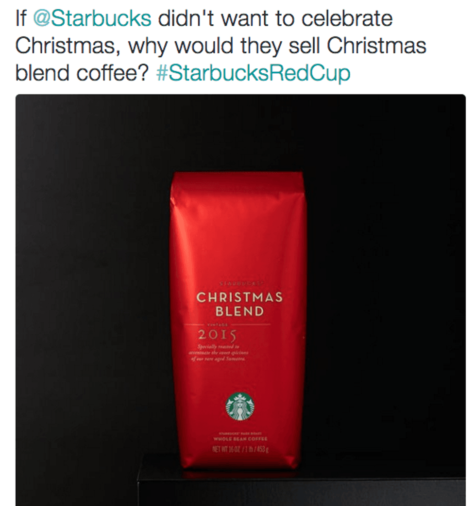
My problem with the incident is while customers complain and post pictures about how disgusted they are with the new design of the season’s cups, they contribute to the company's income. With that said, while they buy the company's products, just to share and post it, they are contradicting their entire argument. Instead of paying five dollars for a cup of the Christmas Blend coffee just to complain, maybe donate it to the homeless man outside of the store. He, unlike you, will appreciate the content and quality of the overall product, not just a simple design alteration that you feel affects your “Christmas spirit”. (Yes, they still have their Christmas Blend- no worries, they’re not total monsters- thank goodness).
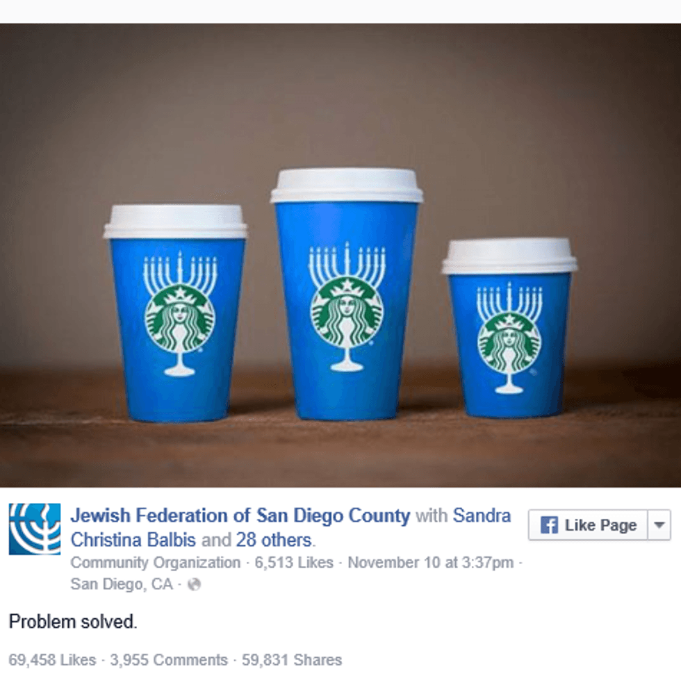
Analyzing the designs above, I simply see a festive and fun printed cup. If the talk is that the company is filled with anti-Christmas tycoons, why is the color combination still red with a hint of green? Argue that the Starbucks girl is always green, but then couldn’t the company make the cups gold? Gray? Silver with some sparkles? Also, I find it hard to side with Joshua Feuerstein about the matter at hand. Seeing that he is a strong religious follower and passionate about the holiday, it confuses me that he is concerned with the red and green color combination. I personally have always broken up Christmas into three categories - The celebration of Christ, the celebration of the tubby man who brings you gifts, and the celebration of both. Although Feuerstein may cherish both sides of the holiday, I question his passion of the commercialized holiday over the priority of his beliefs. Let's also consider some facts I found on social media below.
Just some food for thought:
*Note, the sarcasm level and saltiness in this article is a hard 8*