


Picture your standard, elementary school classroom map. It probably looks something like this:
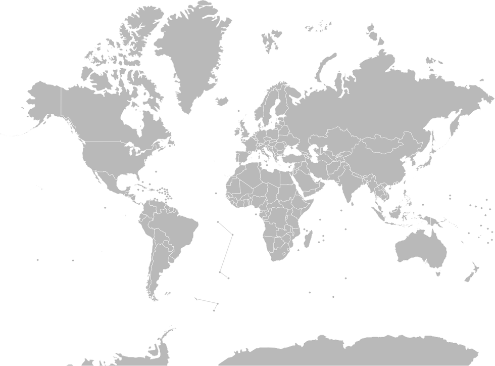
This "normal" map is called the Mercator Projection map, named after the geographer Gerardus Mercator. When he created this projection in 1569, it was useful for navigation purposes because of its stellar ability to display rhumb lines, or "imaginary lines on the Earth's surface which cut all meridians at the same angle." However, the presence of these rhumb lines misrepresents the Earth at the North and South Poles.
In the Mercator projection map, Greenland's land area appears comparable to that of Africa. In reality, Africa's land area is roughly 11.67 million square miles, whereas Greenland's is only about 836 thousand square miles; Africa is almost 14 times larger than Greenland.
Anthropologists, cartographers, and self-proclaimed map enthusiasts don't like to use the Mercator projection because it is so longitudinally skewed. Not only are the dimensions wrong, but it's also culturally problematic.
Europe is placed directly in the center of the map, and both North America (specifically the United States) and Europe appear larger than they really are in comparison to Africa and South America. Europe is the "center of attention" in the Mercator projection, so this map suggests some degree of Eurocentrism, or European (white) exceptionalism. According to Ella Shohat and Robert Stam in their book, "Unthinking Eurocentrism," Europe "is seen as the unique source of meaning, as the world's center of gravity, as ontological 'reality' to the rest of the world's shadow."
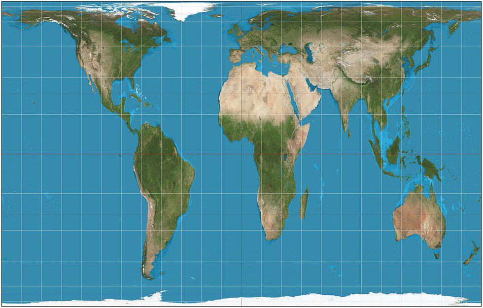
No two-dimensional representation of the Earth is ever going to be perfect because it is impossible to make a three-dimensional object/shape/planet both flat and proportional. However, there are many other types of map projections that work just fine and are - dare I say - less racist. An excellent example of a map that is often compared to the Mercator projection is the Peters projection map (displayed below). It accurately pictures each continent's land area, but distorts shape.
The Mercator projection was great when our primary means of travel and navigation were via sea, but it's time for an update in the American classroom (446 years later). Maybe this time around, Africa will be in the spotlight.