
WARNING: Snobby, arrogant and toxic ranting attitude.
Oh my god, there are so many terrible design out there, but what I'll be ranting about is some horrible posters and fliers hanging around my college art building.
Seriously, though, how can an art building display such horrendous posters in the main hall? It is blasphemy to walk around seeing them literally next to the graphic design rooms. They need to consult with a graphic designer before they post them up.
The idea of a poster, flier or advertisement is so that the viewers can get the message right away. If they take more than three seconds to figure out what it is trying to coney, you just lost your audience. It's common sense.
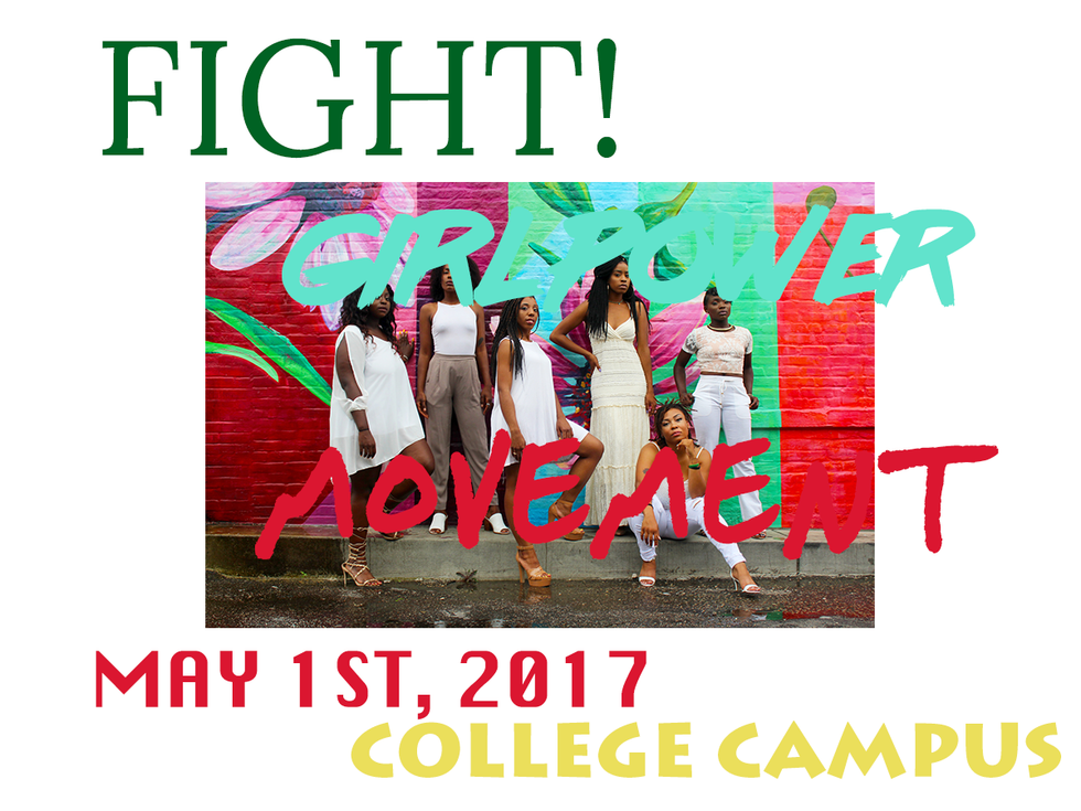
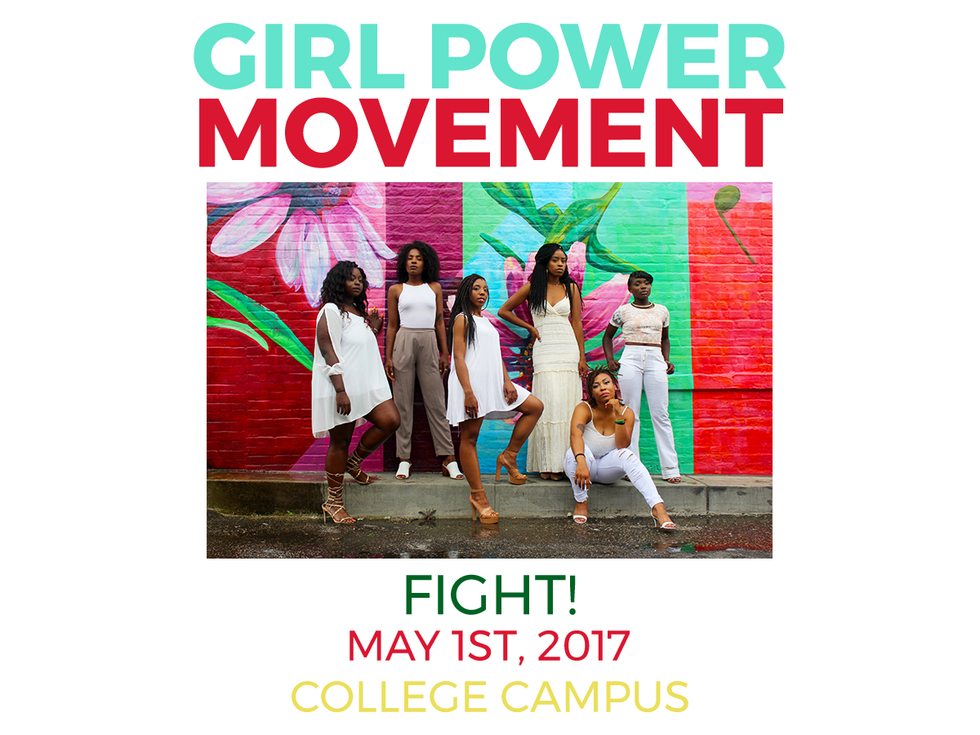
I've seen posters that are tremendously unreadable and just plain horrible. One particular poster broke many sins of graphic design. Below are eight of many deadly sins of graphic design, and possible (but not limited) solutions to fix that. I will be using a random free stock image, and there will be a white border around it for demonstrations. It will start with a terrible design, and I will work my way in fixing it. Also, this is just a random poster.
Sin #1
The text is nearly the same color as the colors in the photo. It's unreadable! Either put a transparent black overlay on top of the photo, so the text could stage out, or move the text outside of the photo. You cannot have one competing for attention with the other. Display which is the more important one. Is it the photo or the text? One has to support the other.

Solutions:


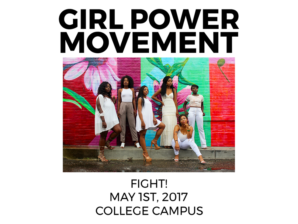
Sin #2
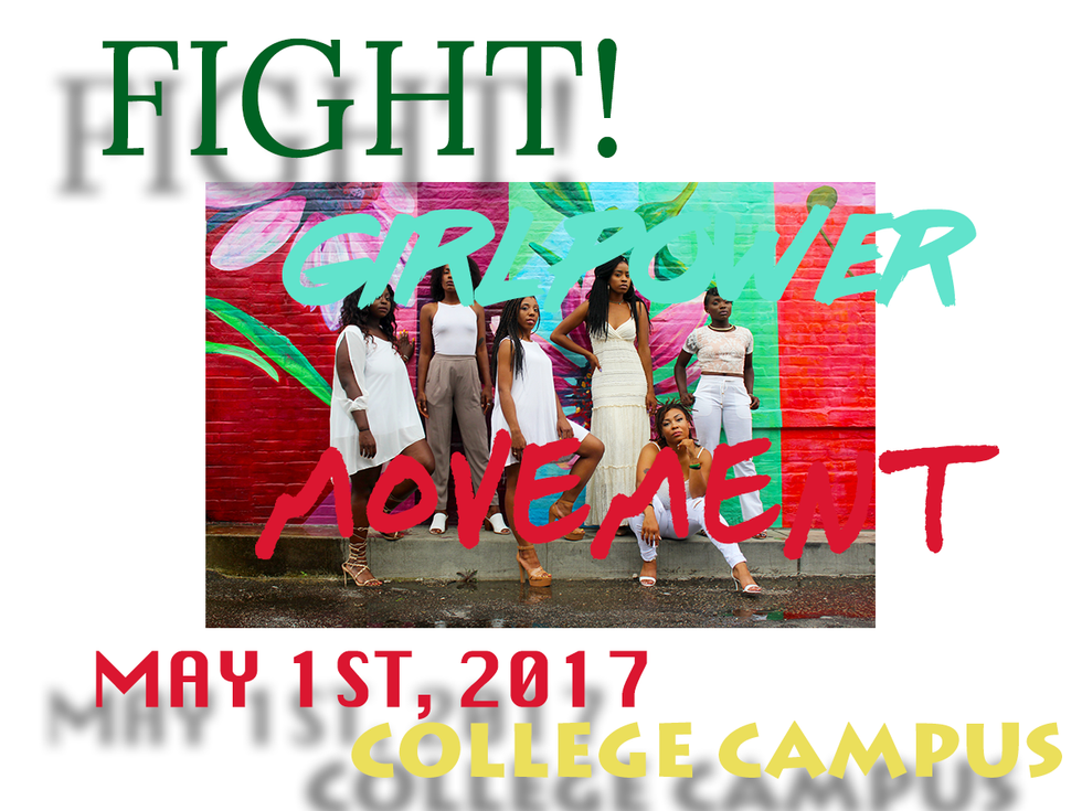
The text starts from inside the photograph, then bleeds outside onto the white border space of the paper. You either keep it inside or put it outside!

Solutions:
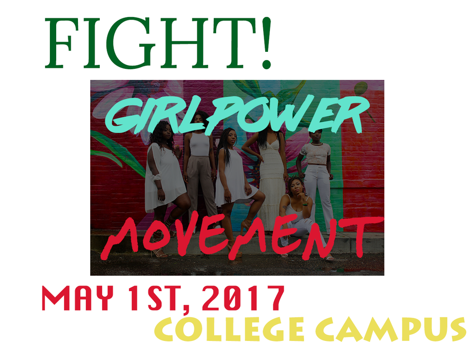
Sin #3
The type choice for the attention header was atrocious! It's some graffiti-inspired typeface that is very illegible. That is totally wrong for a header. You can't expect a reader to figure out what you are trying to advertise if he or she cannot read it. Stick to something simple, don't get too decorative, and don't pick default typefaces.
Solution:

Sin #4
Drop shadows on a print? It's a risky and bold move. I say stay away from it if you're printing. It can never be perfect. However, the person who made this poster went to the extreme. The drop shadows are located massively far from the original text. It was just too extreme and ugly.
Solution:
Sin #5
So many different typefaces! Each typeface is a character or personality on its own. If you have five different typefaces, they all tell different meanings! They are also competing for attention. Which one should I look at first? Which one is more important? Simple questions like these make a huge difference. Best stick to two that can go hand-in-hand with one another, or go take a Typography class. You could do three, but it can be risky.

Solutions:
Sin #6
The texts are flushed left, right, and centered and all over the place. Oh my god, just pick one and stick with it! You're making me give up reading, and you don't want readers to do that! Keep it simple! Flushed left is good enough! You're not at the level to experiment just yet!

Solution:

Sin #7
Too many colors in the text. Again, this is the same for type choices, size, weight, and much more. Stick to one or two colors, and/or keep it consistent!

Solution:
Sin #8
Layout design is badly placed. The overall design is massively unbalanced. No sense of hierarchy. The layout is all over the place, making the viewer difficult to follow along.

Solution:
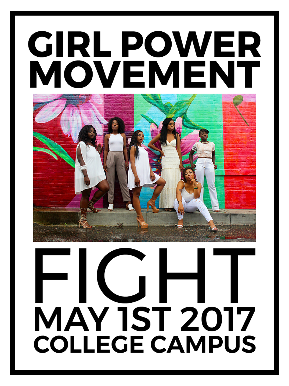
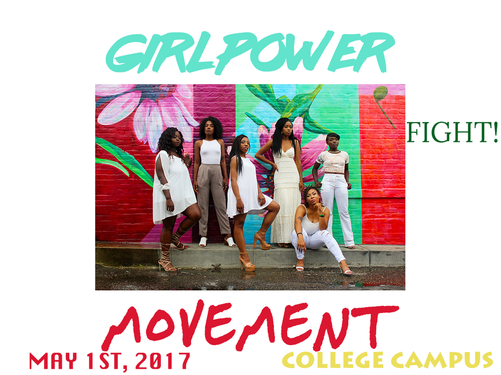
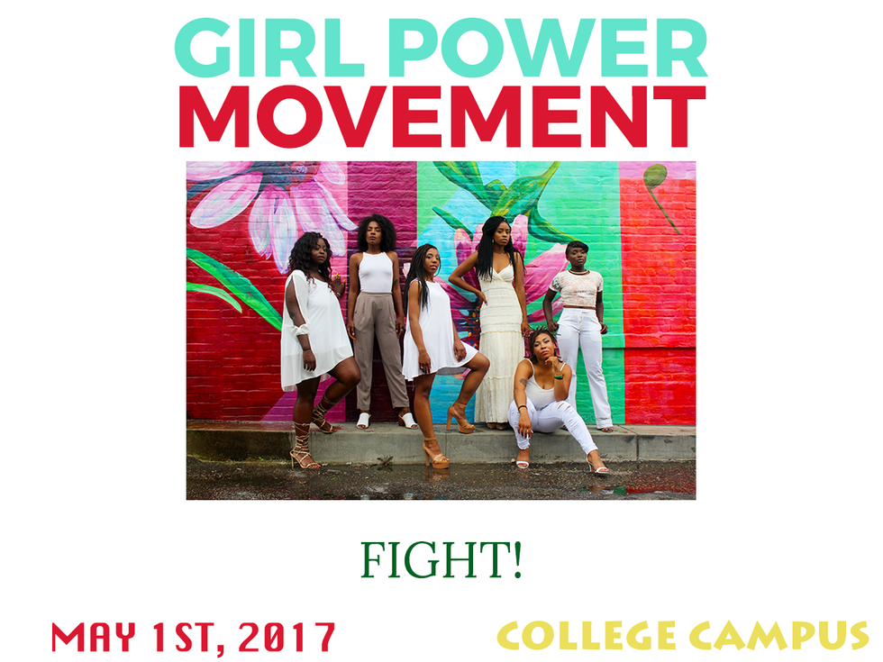
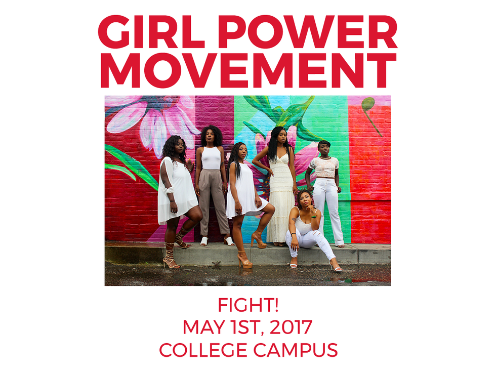
I'm not too proud of this design-wise, but it just looks more balanced and symmetrical. "Fight" is the largest word, but it does not take away from "Girl Power Movement," since that is bold. You get the point. You can read it easily, and you aren't lost. Something so simple can go a long way.
Go on Instagram, Pinterest, AIGA, and get inspired! Look at the history of graphic design and question how something came to be a successful design. Educate yourself!
For fun, visit my Instagram page where I make random colorful pastel graphic arts: https://www.instagram.com/robjasonenate/