


As students, we are constantly using Word for anything school related. Since most of the time we are limited to one or two standard fonts for most assignments, we never truly experience the hundreds of fonts that are offered. Therefore, we never see just how pompous some of these fonts can be.
1. Wide Latin.

This font is just screaming for attention. Remember, less is more.
2. Comic Sans.

3. Apple Chancery.
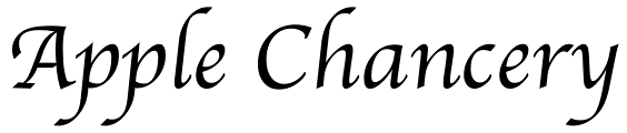
This font sounds like a dessert you would order at a fancy restaurant.
4. Snell Roundhand.

This font sounds like the name of a local jazz band that only plays on Tuesday nights. You're not fooling anyone, "snell roundhand."
5. Papyrus.
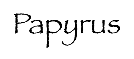
Papyrus, we are not falling for your earthy vibe. Your intentions are true, however, we know better.
6. Times New Roman

As a teacher's favorite go-to, this font has a monopoly over all typed assignments. Though it tries to stay relevant, we know just how long this font been in the game.
7. Big Caslon.

8. Courier New.

What was wrong with the first courier? Does "courier new" even care about how the old one feels? Probably not.
9. Gill Sans Ultra Bold Condensed.

This word tries to intimidate us with its jargon, yet we are all still not convinced this word can even hold its own without the "bold."
10. Edwardian Script ITC.
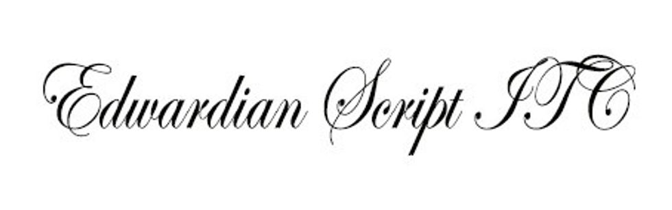
We can't even read this font, so it needs to calm down.
11. Wingdings.

Though unclear as to why these fonts were even considered a font choice, they demand too much attention. Wingdings, just no.