A lot of brands hide messages within their logos to express more about their company in a very clever way. Most people won't take a second look -- only seeing the logo as a whole, rather than looking at the small, interesting details.
Can you spot the hidden images within famous brand logos?
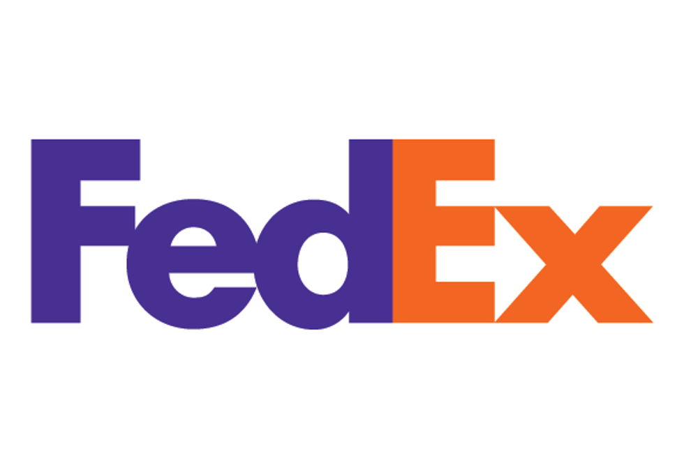
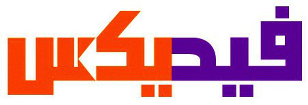
1.) FedEx has one of the most recognizable images in their logo. They advertise their speed and accuracy by hiding an arrow between the 'E' and the 'X'. Even in Arabic, the arrow is still there!
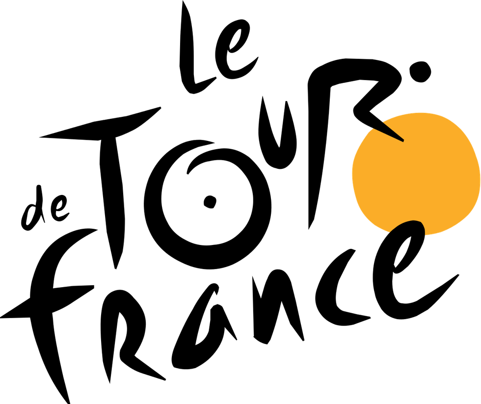
2.) In the Le Tour de France logo, the yellow circle doesn't just represent the sun, it turns into the front wheel of a bicycle. Once you know that, the 'R' in 'Tour' becomes a cyclist. The 'O' becomes the back wheel and the 'U' becomes the seat. So cool!
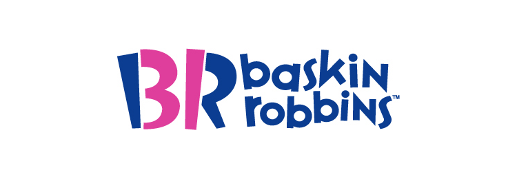
3.) How many flavors of ice cream does Baskin Robbins serve? If you notice, the pink in the logo shows the number 31. It's an interesting way to show how much variety the company offers.
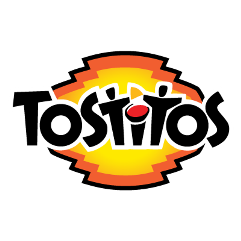
4.) In the Tostitos logo, perhaps you didn't notice the chip and salsa? Well, the two 'T's are people holding a tortilla chip. The dot of the 'I' is replaced with a salsa bowl. It's Tostitos way of representing friends coming together and having a good time.
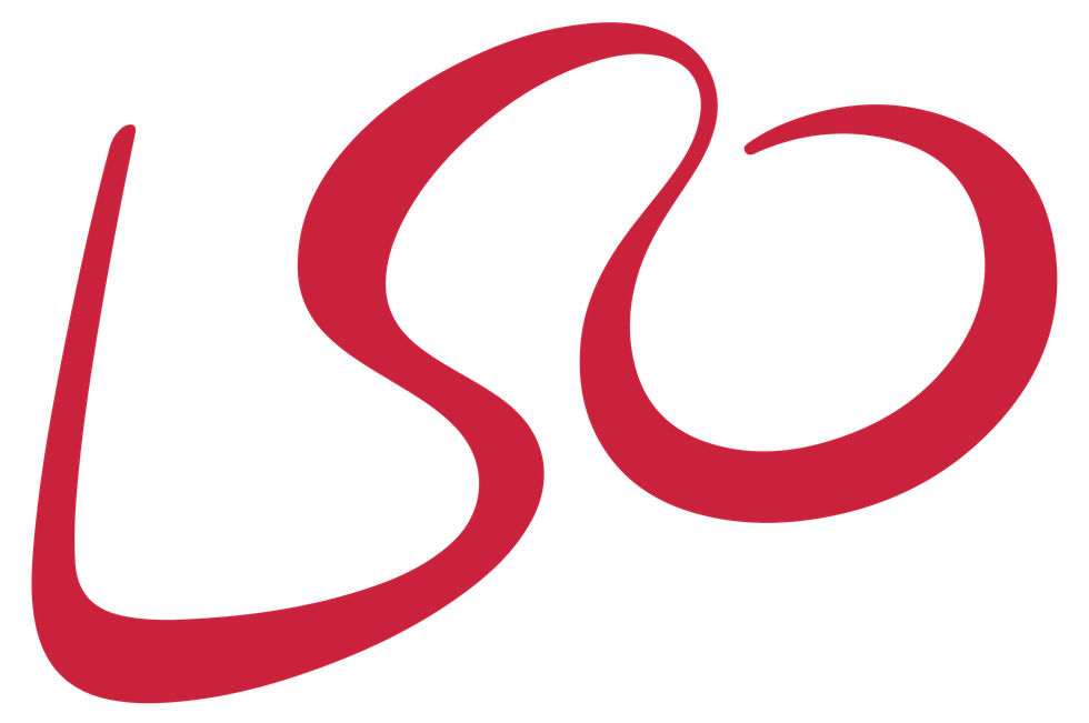
5.) LSO stands for the London Symphony Orchestra. So, what could possibly be hidden in their logo? Can you spot the composer? The arms are the 'L' and the end of the 'O'. The head and neck are the 'S' and beginning of the 'O'. So amazing!
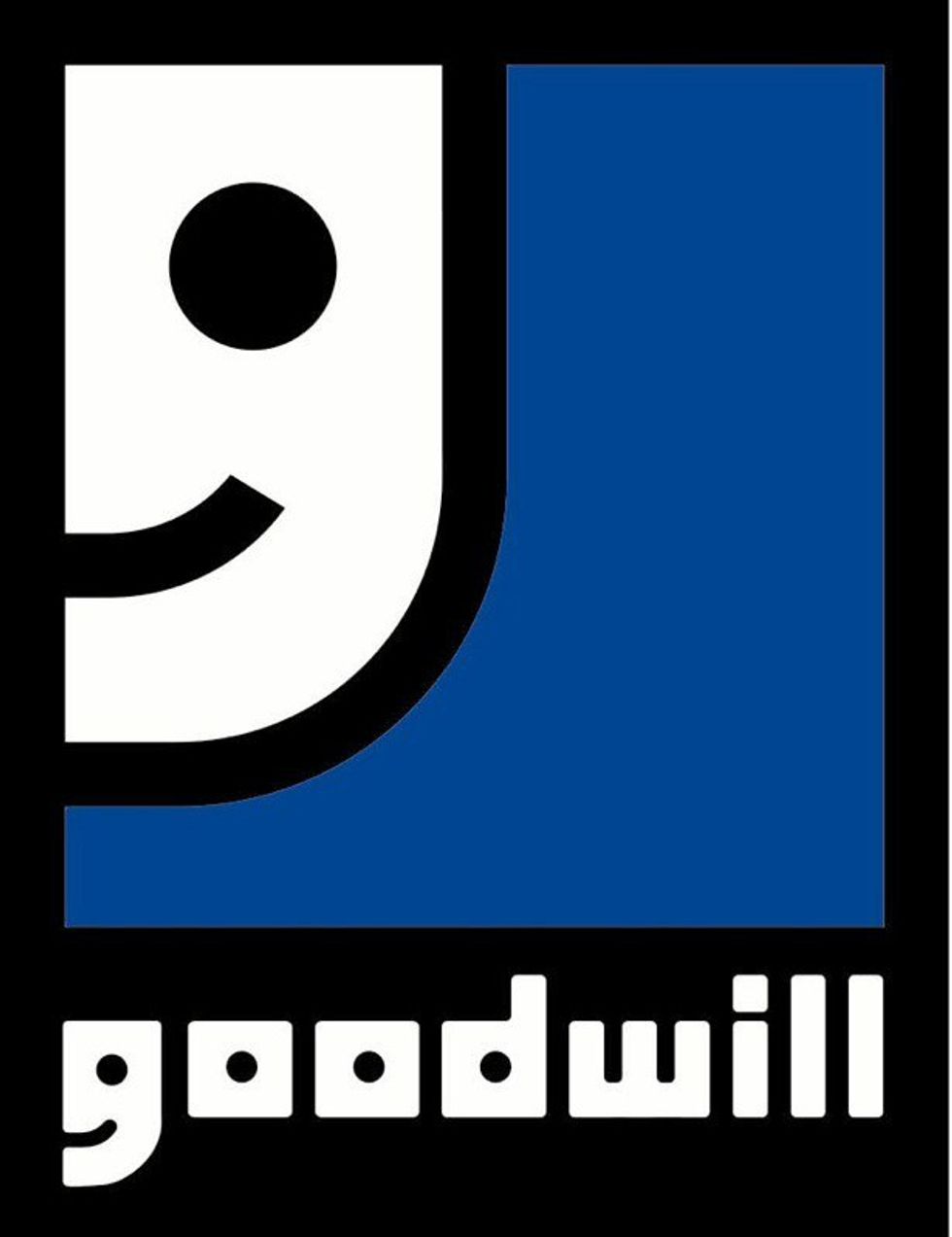
6.) Goodwill has a logo where most people see part of a smiling face. If you notice, where it says 'Goodwill', the 'G' is the same as the logo. It's enlarged to appear like a smiley face as well as the lowercase 'G'.
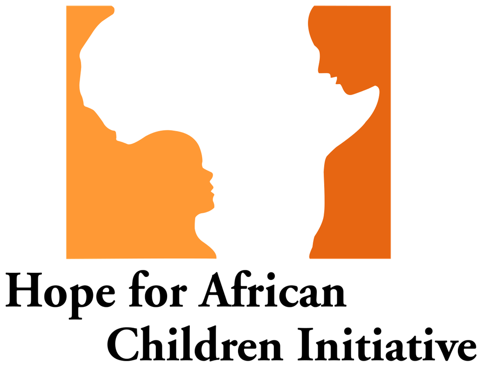
7.) At first glance, you might see the outline of Africa. If you take a closer look, the different shades of orange show an adult and child facing each other. Very unique way of using negative space!
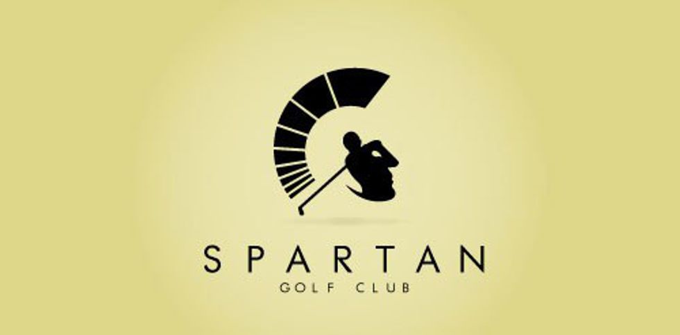
8.) In the Spartan Golf Club logo, it can be seen in two ways. Some people might see a man swinging a golf club. Others may see a Spartan wearing a helmet. Either way, it's a really awesome logo!
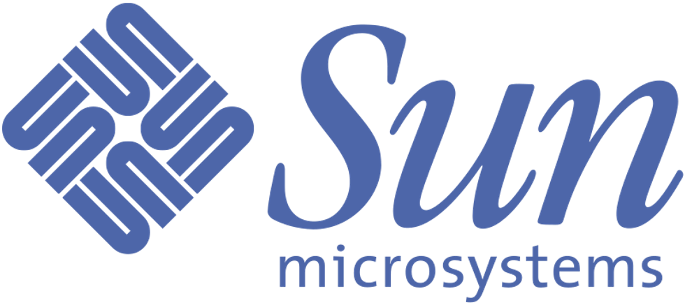
9.) Try looking at the logo upside down or sideways, it will still say the same thing -- 'Sun'. This logo was actually designed to be read in every direction. It was created by Professor Vaughn Pratt of Stanford University. What a genius!
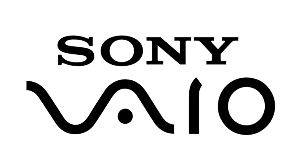
10.) Speaking of genius, this logo represents two different types of computer signals. The 'V' and the 'A' are actually forming an analog signal while the 'I' and the 'O' represent the binary digits 1 and 0. Super smart!
I hope that this list has given you a greater appreciation for what goes into making a logo. There are a lot more out there that have hidden images in them. See if you can spot them all!