
Anyone who has had to do presentations for class or at work has likely made use of PowerPoint or Keynote. Maybe you’ve used OpenOffice or LibreOffice, or something new like Prezi that doesn’t have quite the same interface as the big two. The standard interface is pretty boring, but for most of us it gets the job done just fine. Regardless of the software, you’ve probably still seen some pretty ugly presentations at the college level. I’m not a graphic design major, but here are some simple tips for making better slides.
Show, don’t tell.

Never use this much text in a slide.
Your slides should not be your entire presentation. You’re doing the talking, so the slides should just be a way to keep your thoughts in order and give your audience a visual aid. Don’t crowd the screen with text, and any text you do use should be brief. You don’t need paragraphs, and you don’t even really need complete sentences. The fewer lines of text you put on the slide, the better. Just quick, bullet-pointed facts or graphics that complement or elaborate on your arguments. You don’t even have to use bullet points.
Time is a factor.

Some say to use no more than 15 slides at a rate of two minutes per slide. Others say no more than 24 slides for a total of seven minutes. Whether you’re giving a 15 minute group presentation or an hour-long lecture, keep your time constraints in mind and be sure to leave enough time to answer questions. To that end, only include as many slides as you can effectively make use of. Don’t throw in slides just to have slides. Again, keep the text on each slide brief.
Color.
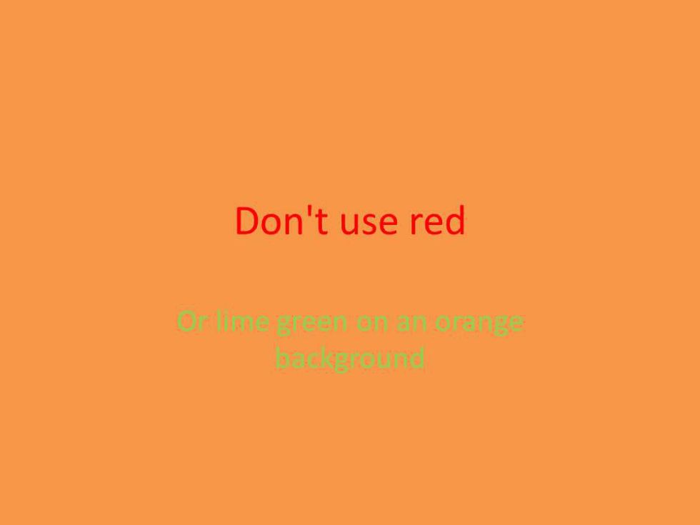
Use background and text colors that complement each other. For backgrounds, it’s good to use “cool” colors, blues or darker shades of green, for instance. Warm colors might make your audience feel sick or disoriented as backgrounds (lime green is a very bad choice), but they’re acceptable for text. So, think white or a cool yellow on a blue background, and darker text colors on a white or gray background. You might think the preset themes are boring or lazy, but take a look at how they balance colors. Watch your own presentation before finalizing it, too. If you can’t stand the color scheme, your audience probably won’t be able to either.
Mix it up.
Building off my first tip, don’t just use a bunch of bullet points or charts. Use a variety of audio and visuals where appropriate. This should go without saying, but keep your pictures, audio or video on topic. Don’t just use random content to spice things up. For example, say you’re doing a presentation on Prince for a History of Pop Music class. You would greatly enhance your project by incorporating audio clips of his songs or video of live performances.


 people sitting on chair in front of computer


 all stars lol GIF by Lifetime
 two women talking while looking at laptop computerPhoto by
  shallow focus photography of two boys doing wacky facesPhoto by
  happy birthday balloons with happy birthday textPhoto by
  itty-bitty living space." | The Genie shows Aladdin how… | Flickr
 shallow focus photography of dog and catPhoto by
  yellow Volkswagen van on roadPhoto by
  orange i have a crush on you neon light signagePhoto by
  5 Tattoos Artist That Will Make You Want A Tattoo
 woman biting pencil while sitting on chair in front of computer during daytimePhoto by
  a scrabbled wooden block spelling the word prizePhoto by
 StableDiffusion
 StableDiffusion
 StableDiffusion

 women sitting on rock near body of waterPhoto by
 Photo by
  Photo by
  Photo by
  Photo by
  Photo by
  Photo by
  Photo by
  Photo by
  Photo by
  Photo by


