
Creating a resume template seems like a pretty simple thing, that is until you realize that you first have to come up with your personal brand, get overwhelmed with all the color palette choices and ultimately end up at your “designer” friend’s door, bribing them with free Starbucks to do it for you. The endless design possibilities paired with the hundreds of thousands of already existing templates online can be intimidating. Trust me, I know. However, it doesn’t have to be.
You don’t have to be an aspiring graphic designer to come up with your own design layout or make an existing template match your unique brand. All it takes is a few deep breaths (seriously, you need to breathe), a little self-confidence, and these easy tips.
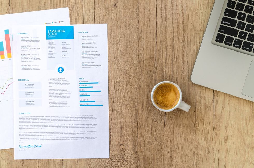
An elaborate resume isn’t your goal.
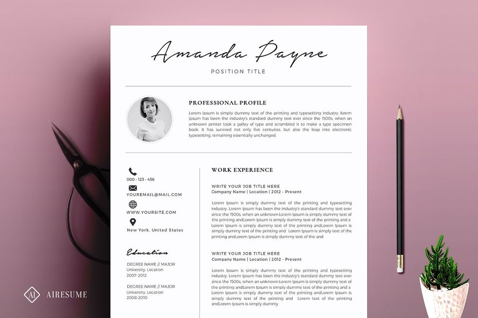
Keep in mind that you never know whose hands your resume is going to end up in. Often times companies will have a few levels of people to filter out resumes and not all of them will be impressed by one with a three dimensional Work History section or a reinvented “Skill Level” chart. For this reason, even people going into artistic positions usually design their resume to be more clean cut than their other work.
The point of a resume is to showcase your skills, accomplishments, and past career opportunities so the goal your layout should accomplish is simply framing them in their best light. The person reading your resume should be able to actually read it in a way that isn’t confusing or unappealing. The best way to accomplish this is by maintaining balance on the page, choosing readable and appropriate fonts, and not being afraid of minimalism. A little white space isn’t a bad thing. It lets the eyes rest from all of the information being compiled onto one page.
If you thought about using Microsoft Office, you’re wrong.

You only want to use Microsoft Office to simply type your information out. It is worth it to try and learn Adobe Indesign. If you use their free trial and watch a couple videos on YouTube, I promise it could be a fast and painless experience. It will make your resume stand out so much more.
There is something easier than Adobe that you could use to get the sleek and creative resume you want, but it’s almost a sin for me to say it as a graphic designer: if you absolutely cannot use InDesign, use Canva. It is a site that offers an online software for designing various template-based publications and all the features you would need are freely accessible. A word of warning, however, it is very important that you use Canva’s templates as more of a beginning guideline rather than a cookie cutter template to make yours unique.
Decide on what you want first.
What? That’s not a tip! It’s actually one of the most important tips for saving you a lot of time and mental stress when figuring out your resume design. When you start working on your resume, you are going to search online for examples of unique resume templates. You are going to see a lot of templates you like. Then a lot more that you like. Before you know it, what could have been a mood board turns into a full-on panic attack. Instead, look at the elements you like, not at the full templates you like.
Of course, your design can evolve, but it’s not going to help you to continue looking through example templates in the middle of designing your own. It’s going to make you want to drop everything and start a new one every time. Make decisions and don’t look back, there’s always enough time for a re-brand later.
Let your friends read it.
Not only is it good to proofread anything you create, your peers can also make sure your resume is readable with all of the shiny new design elements you’ve added.
Ask them questions like:
- Is it easy to read? To understand?
- Does the section placement make sense?
- What stands out?
- Where do your eyes go when you first look at it? Where do they end up?
These are all important questions in knowing how your resume will be received, which could likely make or break your applications.

 Photo by
  Photo by
  Photo by
  Photo by

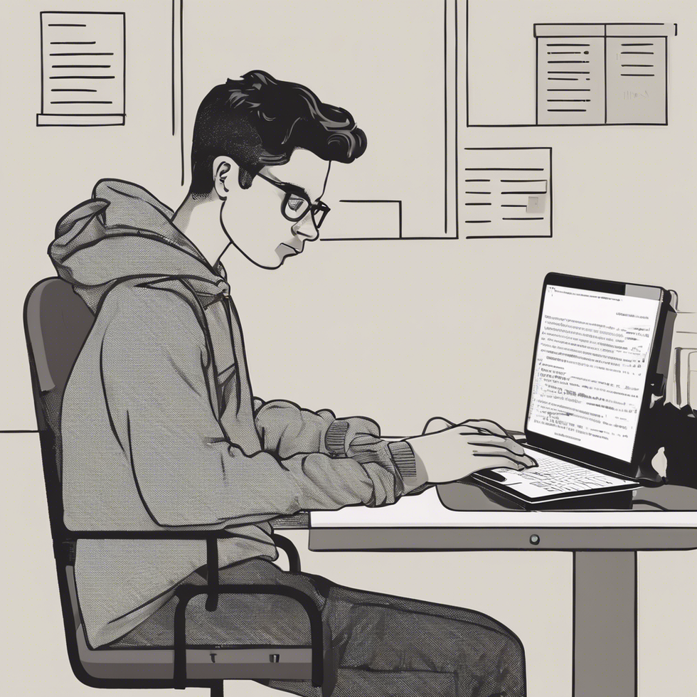
 people sitting on chair in front of computer

 all stars lol GIF by Lifetime
 two women talking while looking at laptop computerPhoto by
  shallow focus photography of two boys doing wacky facesPhoto by
  happy birthday balloons with happy birthday textPhoto by
  itty-bitty living space." | The Genie shows Aladdin how… | Flickr
 shallow focus photography of dog and catPhoto by
  yellow Volkswagen van on roadPhoto by
 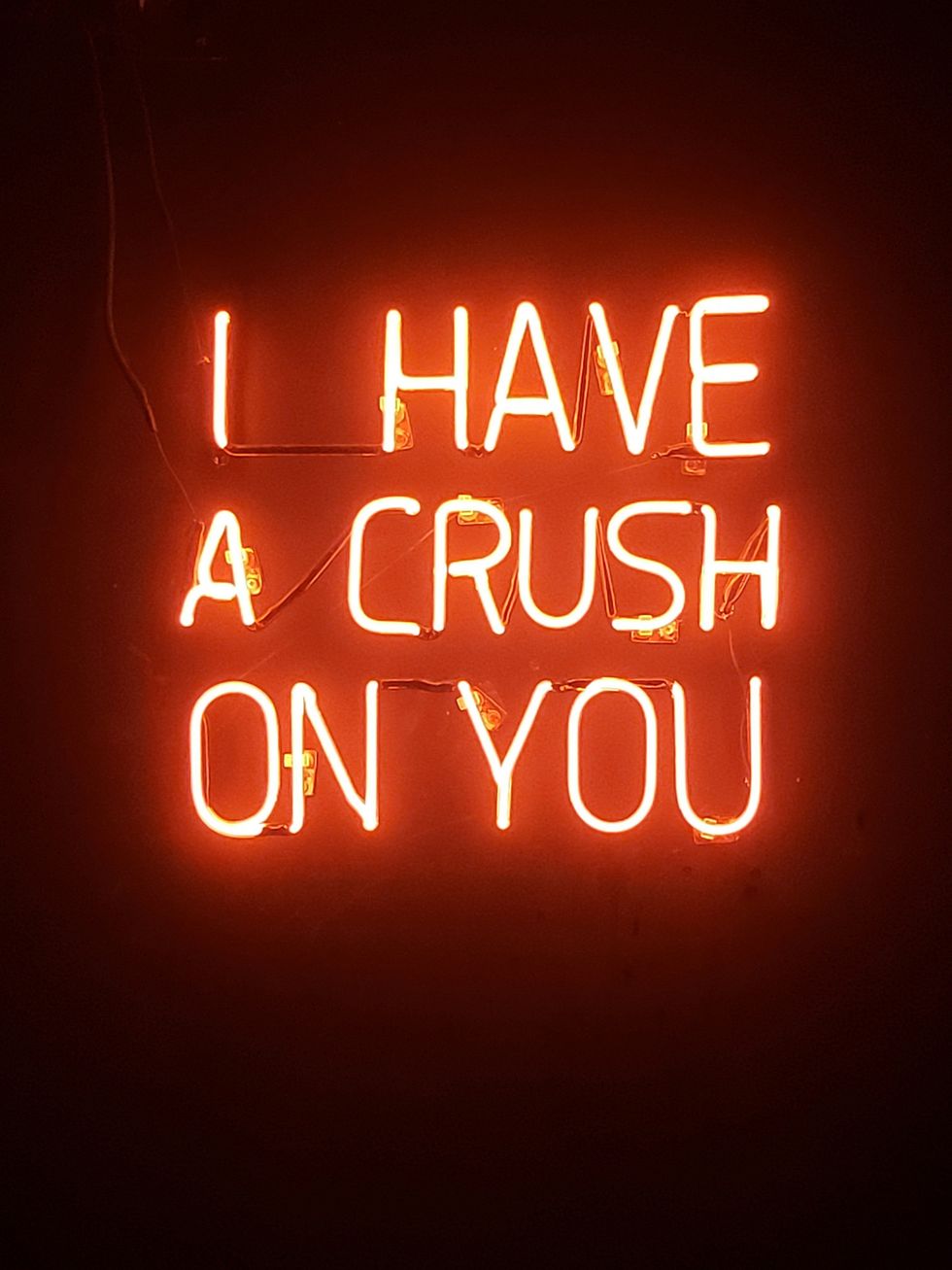 orange i have a crush on you neon light signagePhoto by
  5 Tattoos Artist That Will Make You Want A Tattoo
 woman biting pencil while sitting on chair in front of computer during daytimePhoto by
  a scrabbled wooden block spelling the word prizePhoto by
 StableDiffusion
 StableDiffusion
 StableDiffusion

 women sitting on rock near body of waterPhoto by


