

To all the females readers,
when looking in your bathroom, do you notice that your shampoo, razors, soap and other products tend to be pink, purple or a bright "girly" color? When reading the packaging of the products you use, do you notice that it claims to make your skin silky or smooth? When looking at the packaging of the drinks or food you eat, does it have a lot of descriptions about the calories or amount of sugar?
To all the male readers,
when looking in your bathroom, do you notice that your shampoo, razors, soap and other products tend to be blue, black or a dark color? When reading the packaging of the products you use, do you notice that it talks about being powerful, large or about being active? When looking at the packaging of the drinks or food you eat, does it ever mention it being "low-cal" or "sugar-free"? No? interesting...
If you answered "yes" to any of these questions, then you are not alone. Companies often times use manipulative language and colors when promoting a product for a certain gender. To find more information regarding this issue, I did some research. I went on the online store websites for Target, Walmart, Staples, Amazon and Home Depot and analyzed the word choice and color use in many of there products.
Here is what I found...


What this shows us:
- Companies use specific words and colors that support gender roles and stereotypes when advertising products for a specific gender.
- Women products use words and phrases to make the product appear as if it brings some level of happiness or joy. The words used also promotes the idea that the product has the ability to allow women to maintain or get a skinny figure. The female consumer products that are shown above almost all included numbers such as calories or sugar amounts on the front of the product package and within the descriptions. Using words such as "light," "small," and "beautiful" promote the idea that women who look petite or small fit the beauty standard. Women products also used words such as "soft, silky, smooth and easy." These words associate women with having to be easy-going and not aggressive or tough. These words have the power to make women feel as if their skin has to be smooth or soft and that they should use products that are smaller or that smell a certain way. The language choice in these products also undermine the ability of women by constantly stating that they are "easy" to use and figure out. These companies manipulate women into buying items that are pink, purple or "soft" pastel colors. Pictures such as flowers and words such as "sensual" are often seen to be appealing to women and that is why they are seen on several packages.
- Male products tend to promote a sense of "toughness." These products are packaged in dark colors such as green, red and black and they push the standard of being active, tough and "manly." Male shoppers can often feel the pressure to buy products that won't make people question their sexuality or level of manliness. These products do not take into account that all men are built different and that all men do not enjoy the same activities. The product descriptions and names promote that the product is "larger" or "man-size."
- The stereotype of women being petite, beautiful, and calm and men being large, active and tough has been present for centuries and these products fully support those ideas

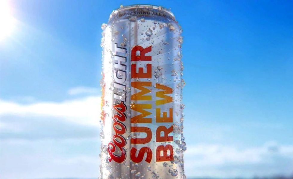
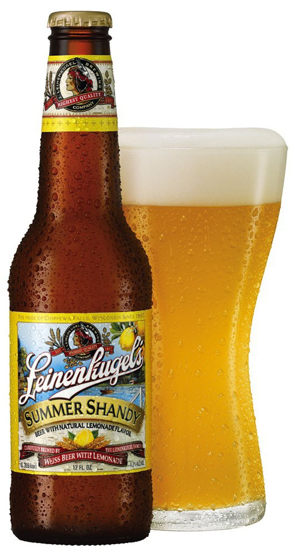
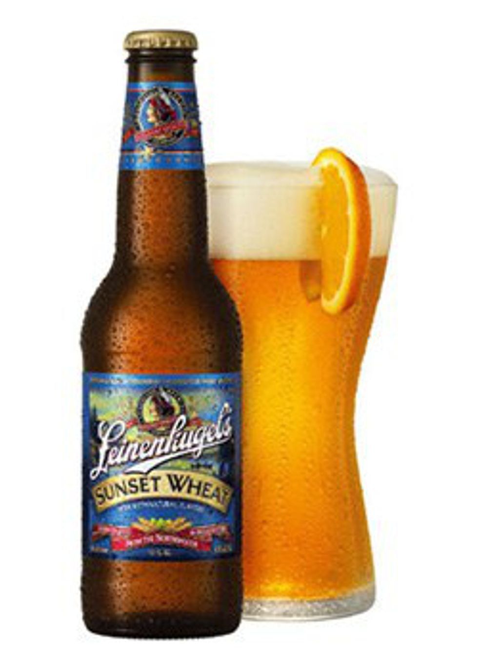


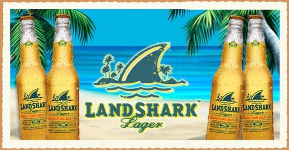


 Photo by
  Photo by
  Photo by
  Photo by
  Photo by
  Photo by
  Photo by


 File:Hampton Beach, New Hampshire - low tide - panoramio.jpg ...
 fire on fire pit during night time
Photo by
fire on fire pit during night time
Photo by  Free Images : american lobster, dish, new england clam bake ...
 vanilla flavor ice cream with chocolate syrup
Photo by
vanilla flavor ice cream with chocolate syrup
Photo by  File:Celebrity Silhouette (ship, 2011) 002.jpg - Wikimedia Commons


