
Warning: Some of what you’re about to see is horrifyingly hilarious, tragic and embarrassing. Let’s begin!
For most college students, the rise of social media began in middle school/the early years of high school. There’s no denying these were dark and embarrassing times on social media and IRL. Not only was the content on social media rough during its early stages, but the looks of the actual apps were too.
Believe it or not, the old-school social media looks are harder to find than you’d think. Soon, they’ll be nothing but a memory, and even that will eventually fade. After turning to Google, which partially failed me, I did the unthinkable: I dove into the depths of my really old photos/screenshots. I managed to scavenge up a few keepers for the sake of completing this trip down memory lane (so bear with me). Here are the world’s most beloved social media in most of their former and current glory.
Then:

Remember when the bar containing all of the important buttons was on the top? It was blue, too! Look at that news feed and profile layout. Can you imagine using Facebook like this right now?
Now:


What a transformation! So sleek. So modern. Back in the old days, you could only like photos. Today, you can react to statuses and photos, too. Technology, man.
Then:
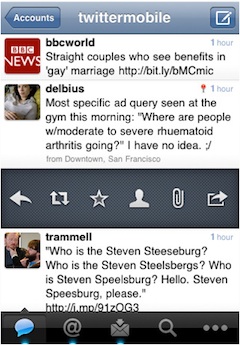
Only 90s kids will remember this version of Twitter.


Looking at this version of Twitter is like stepping into an alternate universe. Let's also take a moment to appreciate the fact that my past self didn't go through with sending those tweet drafts.

The Twitter profile picture, or avi as the cool kids call it, used to be in the middle of the header. Seems pretty logical.

R.I.P to the star "favorite" button. It's probably up in the sky with all of the real stars now. It's where it truly belongs.
Now:

We now live in a world where favorites have become likes and Twitter's main color is white with blue and gray buttons. It's not a bad world, just a different one.
Then:

The original Instagram logo will never be forgotten.

This was beginning of something great.

The gray borders around the photos almost make them seem 3-D. You could pull one straight out of the screen! The real question is: Who decided that a hot air balloon was the way to go to portray filter options?

Instagram's first decent attempt at a more modern look.

Little did we know, this was the last we'd see of the star-looking explore page button.

This was a depressing year for Instagram users when the custom location feature was removed. Tears for days. Bring back custom locations 2016.
Now:
![]()
I really don't understand how Instagram went from its original logo to this disaster. I see the modernization in the white design, but I don't see where the color choices came from.

Instagram pretty much went from color to mainly white, just like Twitter did. Its likes were recently switched up to mirror those on Facebook. But hey, at least the hot air balloon is gone!
Snapchat
Then:

You have to admit that ghost coming out of the tiny box (signifying you opened a snap) was pretty dang adorable.
![]()
R.I.P tiny ghost in a box.

Oh, the days when you see other people's best friends on Snapchat. It's probably for the best that this feature was removed...maybe.

Introducing live stories! How exciting and annoying. The streaks and emojis made up for it.
Live stories weren't enough to help you procrastinate, so Snapchat decided to add "Discover" channels to further your
Now:

Snapchat recently changed its name to Snap Inc. The Discover channels were given a makeover, which wasn't too shabby. And, for some reason, the "chat" feature was moved to the top of the screen. Times are a-changing, indeed.

 women in street dancing
Photo by
women in street dancing
Photo by  man and woman standing in front of louver door
Photo by
man and woman standing in front of louver door
Photo by 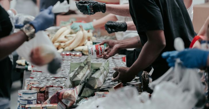 man in black t-shirt holding coca cola bottle
Photo by
man in black t-shirt holding coca cola bottle
Photo by 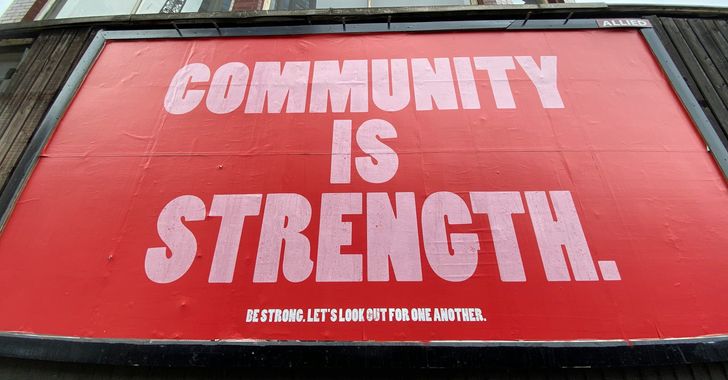 red and white coca cola signage
Photo by
red and white coca cola signage
Photo by 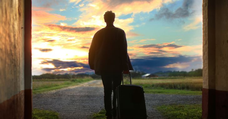 man holding luggage photo
Photo by
man holding luggage photo
Photo by  topless boy in blue denim jeans riding red bicycle during daytime
Photo by
topless boy in blue denim jeans riding red bicycle during daytime
Photo by  trust spelled with wooden letter blocks on a table
Photo by
trust spelled with wooden letter blocks on a table
Photo by 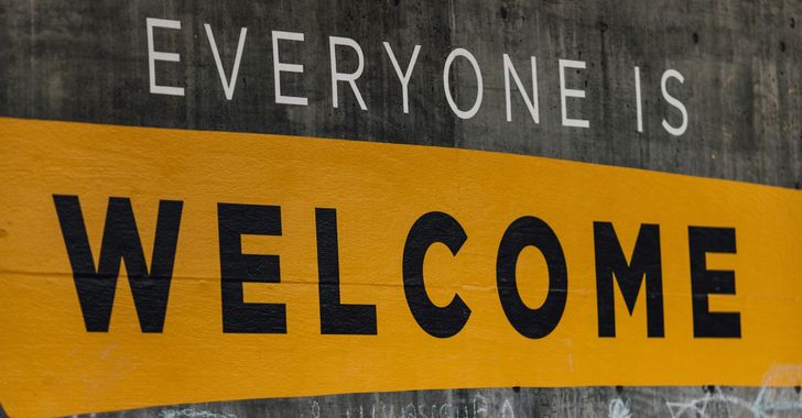 Everyone is Welcome signage
Photo by
Everyone is Welcome signage
Photo by  man with cap and background with red and pink wall l
Photo by
man with cap and background with red and pink wall l
Photo by  difficult roads lead to beautiful destinations desk decor
Photo by
difficult roads lead to beautiful destinations desk decor
Photo by  photography of woman pointing her finger near an man
Photo by
photography of woman pointing her finger near an man
Photo by  closeup photography of woman smiling
Photo by
closeup photography of woman smiling
Photo by  a man doing a trick on a skateboard
Photo by
a man doing a trick on a skateboard
Photo by  two men
  running man on bridge
Photo by
running man on bridge
Photo by  orange white and black bag
Photo by
orange white and black bag
Photo by  girl sitting on gray rocks
Photo by
girl sitting on gray rocks
Photo by  assorted-color painted wall with painting materials
Photo by
assorted-color painted wall with painting materials
Photo by  three women sitting on brown wooden bench
Photo by
three women sitting on brown wooden bench
Photo by 
 Photo by
  Photo by
  Photo by
  Photo by
 people sitting on chair in front of computer

 all stars lol GIF by Lifetime
 two women talking while looking at laptop computerPhoto by
 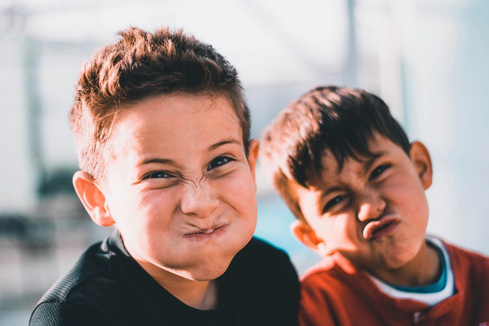 shallow focus photography of two boys doing wacky facesPhoto by
  happy birthday balloons with happy birthday textPhoto by
  itty-bitty living space." | The Genie shows Aladdin how… | Flickr
 shallow focus photography of dog and catPhoto by
  yellow Volkswagen van on roadPhoto by
  orange i have a crush on you neon light signagePhoto by
  5 Tattoos Artist That Will Make You Want A Tattoo
 woman biting pencil while sitting on chair in front of computer during daytimePhoto by
  a scrabbled wooden block spelling the word prizePhoto by
 StableDiffusion
 StableDiffusion
 StableDiffusion


