
There are multiple times in a day that I will see someone's Instagram and admire how aesthetically pleasing their feed is to look at.
Each individual picture is great, of course, but it's even more impressive that each picture makes each other picture look good. In the past, I would just admire it before deciding I wanted to make mine aesthetic. However, around two posts in I would fail, and the dream of having an Instagram like that was ruined. I tried to look up articles to see if that would help, but in the end, they just left me more confused.
Eventually, I figured it out, but it took a little a bit of work to figure out and quite a bit more to maintain. If you're looking to create an aesthetic Instagram feed, then follow these easy steps below!
1. Pick your colors
Pick the colors that you want to stand out in your feed. When I started trying to work towards an aesthetic, I picked around three to four colors that I wanted to be the theme of my feed. For a summery feed, pick brighter colors, such as bright pinks, blues, and yellows. For a fall feed, pick different shades of brown, red, and maybe some orange. For a spring feed, pick more pastel colors. For a winter feed, greys, blues, and white might be ideal colors to pick.
However, when picking your colors, make sure you have enough of that color clothing-wise. If you don't have a lot of yellow shirts, don't pick yellow, because keeping your feed looking the way you want it will become much more difficult. It would also be ideal to make one of your core colors a neutral color, such as black, white, grey, or brown, because you can almost always find a background or shirt with one of these colors, which definitely will make your life easier.
Finally, whatever pictures you want to post, make sure that they fit your color theme first. If they do, proceed. If not, then find one that does and post the others behind that.
2. Find your edit
If you don't like using edits, then you can skip this step, but I really think it helps the pictures to look more alike.
If you're really reluctant on filters, but want your pictures to appear even a little more similar, then add an edit and dial down in the settings to a lower, lighter filter. My personal favorite editing tool is VSCO, but there are also adobe editing apps available if you prefer that. Whatever edits you choose to add to your pictures, though, be sure you use in the exact same way on the rest of the pictures that you're posting.
You need to stay consistent with how you're editing them so they look similar. At the bottom of this article you can find some themes I have found that others use if you want to play around with various edits.
3. Check with Unum
After you're all done picking pictures and editing them, you can check how it would look against the rest of your feed using the UNUM app. It's an app that pulls up all of your Instagram pictures and lets you see what your picture would look like if you posted it without you actually posting it yet. Here, you can clearly see if it fits your established theme or not. If you're just posting the first picture for your theme, then you don't have to worry about this step just yet.
4. Tips
Keeping up an aesthetic is actually a bit more work than it seems like, so it'll be more of a conscious effort than you may realize. That being said, if you know you're going somewhere or doing something that day that you think you might want to post about later, make an effort to wear a color that fits your theme.
When you take pictures, try to take them against backgrounds that are a core color in your scheme. If you find this tedious, then grab a buddy, an outfit that fits your chosen colors, and have a photo shoot day so you can rack up on picture ammunition for future posts. If you have any questions, feel free to reach out to me @jmyerss_17 (shameless plug)
5. Themes
Oranges and Browns - KK2 (+6.0) filter, -1.00 Exposure, +0.5 Contrast, +0.4 Saturation, -0.5 Temperature, +3.00 Vignette, +3.00 Grain
Purples and Pastels - No filter, +0.5 Exposure, +0.7 Contrast, +0.5 Saturation, -0.1 Temperature, +0.1 Tint
Pinks - C1 (+6.0) filter, -0.04 Exposure, +1.0 Contrast,-1.0 Temperature, +1.0 Tint
Yellow and Pink - KK2 (+5.5) filter, +1.5 Contrast, -0.5 Temperature, +4.00 Vignette, +3.0 Grain
Brown - M3 (+6.0) filter, No exposure, +1.0 Contrast, -0.5 Temperature, +0.5 Saturation, +3.0 Grain, +3.0 Vignette
"Flawless Glow" - C1 (+12.0) filter, -2.7 Exposure, -1.5 Contrast, +3.9 Shadows, +12.0 Highlights, -1.3 Temperature, +3.7 Tint, +2.0 Saturation, +5.0 Fade
"Wishing Breeze" - -1.4 Exposure, -2.1 Contrast, +4.2 Shadows, +12.0 Highlights, -4.2 Temperature
"90's Film" - -6.0 Exposure, -6.0 Contrasrt, +1.0 Shadows, +12.0 Highlights, +1.0 Temperature
"Summer Grunge" - C1 (+12.0) filter, -3.1 Exposure, +0.9 Temperature, +0.3 Saturation
"Bring Life Back" - +3.6 Exposure, +1.5 Contrast, +5. Shadows, +12.0 Highlights, +3.5 Saturation, +5.5 Skin tone
"Blues Clues" (Only black and blue in pictures) - +6.0 Contrast, -2.0 Saturation
"Faded Pink" - -6.0 Contrast, -0.8 Exposure, +11.5 Fade, -2.9 Grain
"Desert Days" - -2.5 Exposure, -2.5 Contrast, +2.0 Highlights, +3.0 Fade
"Dark Soul" - B5 (+12.0) filter, -1.0 Exposure, +0.4 Contrast, +1.8 Vignette, +1.1 Highlights, +1.1 Clarity
Remember, these themes and edits will only work if you first have the same general color theme in your pictures. Play around and see what you like. Never be afraid to switch your aesthetic halfway through if you aren't happy with it or want something new! Finally, enjoy your newly aesthetic Instagram!

 women in street dancing
Photo by
women in street dancing
Photo by  man and woman standing in front of louver door
Photo by
man and woman standing in front of louver door
Photo by  man in black t-shirt holding coca cola bottle
Photo by
man in black t-shirt holding coca cola bottle
Photo by  red and white coca cola signage
Photo by
red and white coca cola signage
Photo by  man holding luggage photo
Photo by
man holding luggage photo
Photo by  topless boy in blue denim jeans riding red bicycle during daytime
Photo by
topless boy in blue denim jeans riding red bicycle during daytime
Photo by  trust spelled with wooden letter blocks on a table
Photo by
trust spelled with wooden letter blocks on a table
Photo by  Everyone is Welcome signage
Photo by
Everyone is Welcome signage
Photo by  man with cap and background with red and pink wall l
Photo by
man with cap and background with red and pink wall l
Photo by  difficult roads lead to beautiful destinations desk decor
Photo by
difficult roads lead to beautiful destinations desk decor
Photo by  photography of woman pointing her finger near an man
Photo by
photography of woman pointing her finger near an man
Photo by  closeup photography of woman smiling
Photo by
closeup photography of woman smiling
Photo by  a man doing a trick on a skateboard
Photo by
a man doing a trick on a skateboard
Photo by  two men
  running man on bridge
Photo by
running man on bridge
Photo by  orange white and black bag
Photo by
orange white and black bag
Photo by  girl sitting on gray rocks
Photo by
girl sitting on gray rocks
Photo by 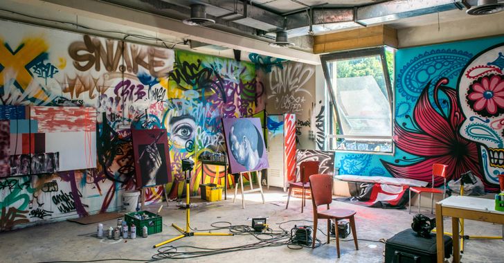 assorted-color painted wall with painting materials
Photo by
assorted-color painted wall with painting materials
Photo by 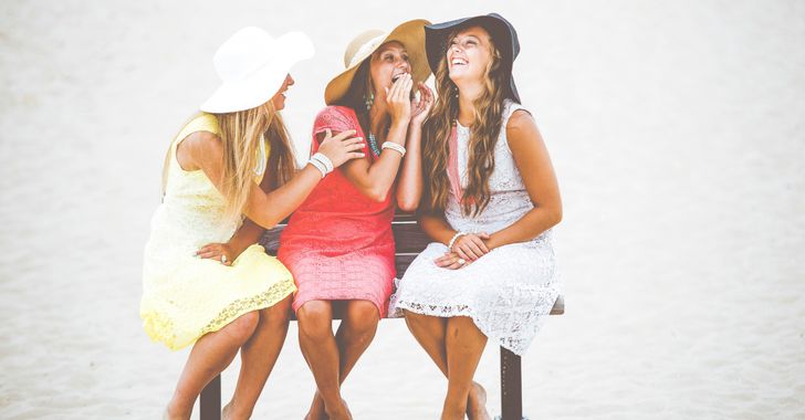 three women sitting on brown wooden bench
Photo by
three women sitting on brown wooden bench
Photo by 
 Photo by
 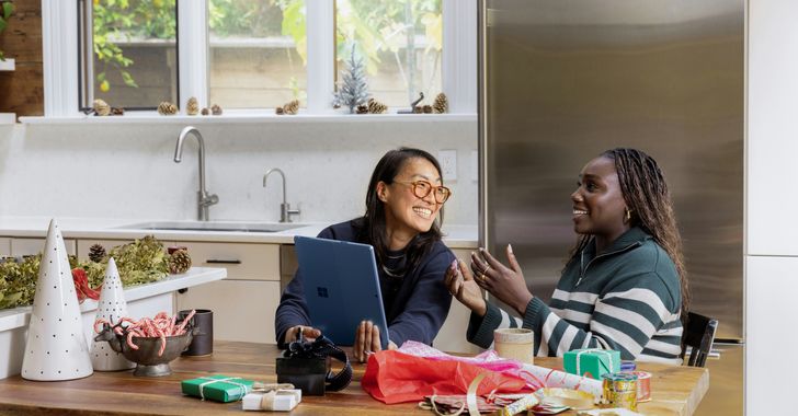 Photo by
  Photo by
  Photo by

 people sitting on chair in front of computer
 all stars lol GIF by Lifetime
 two women talking while looking at laptop computerPhoto by
  shallow focus photography of two boys doing wacky facesPhoto by
  happy birthday balloons with happy birthday textPhoto by
  itty-bitty living space." | The Genie shows Aladdin how… | Flickr
 shallow focus photography of dog and catPhoto by
  yellow Volkswagen van on roadPhoto by
  orange i have a crush on you neon light signagePhoto by
  5 Tattoos Artist That Will Make You Want A Tattoo
 woman biting pencil while sitting on chair in front of computer during daytimePhoto by
  a scrabbled wooden block spelling the word prizePhoto by
 StableDiffusion
 StableDiffusion
 StableDiffusion


