
Last week, Adidas revealed the new jerseys they have created for the National Hockey Leagues' 32 teams. In the Adidas news stream, they said that these jerseys are supposed to be 19% lighter, up to 133% more permeable (making it cooler), 27% stronger in burst testing and 72% tougher in abrasion tests. While some teams' jerseys, such as the New York Rangers, have almost the exact same appearance as their previous jerseys, other teams, such as the Devils, will be wearing jerseys that have a slightly different look than their previous ones.
Yes, the new Devils jerseys are missing their bottom stripes, and yes, while I'm not in a fit of rage over it, I am pretty bothered by it.
It could just be that I'm not a big fan of change, but according to this screenshot of the Devils' twitter bio after the jersey reveal, it seems I'm not alone in my opinion.
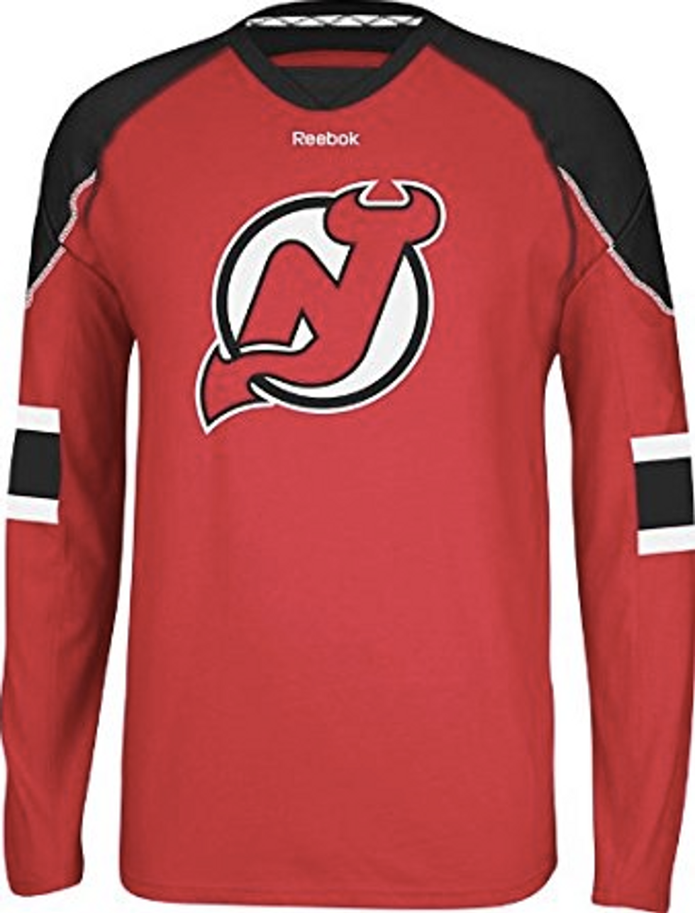
The Devils have had basically the same jersey since they became the New Jersey Devils in 1982. They have only had two different jerseys, the red-and-green jerseys they used for their first ten years as a team (and continue to use as their only alternate jerseys), and the red-and-black ones they had used from 1992-2017. 

The only main differences these two jerseys have are the colors and some of the details such as size and quantity of the stripes, but it was always the same concept: stripes on the sleeves, stripes on the bottom, and a colored panel that spans from shoulder to shoulder.
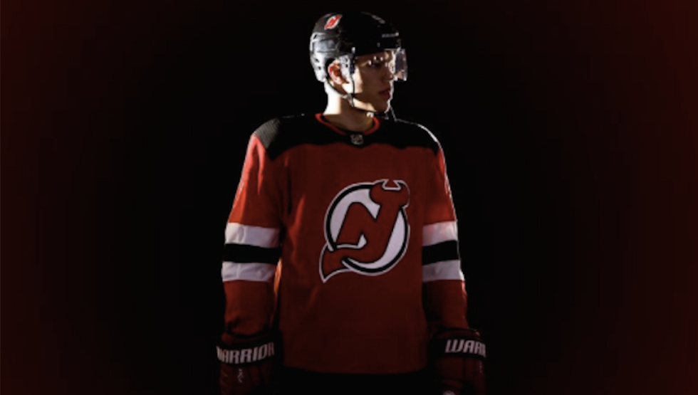
But then, Adidas releases the new Devils jerseys, and they look like this. No stripes on the bottom of the jersey besides a teeny tiny black one lining the bottom. But the signature stripes are gone, poof, vanished and are now a ghost of jerseys past. Where did they go, you ask? I have no clue.
To me, the new jersey reminds me of a long sleeve shirt that is trying to be a hockey jersey but is not quite there. You know, like one of these:
These shirts are advertised on Amazon as a "Long sleeve jersey tee," and they look very similar to the new jerseys.
I understand that Adidas seems to have headed in a more streamlined, simpler direction when it comes to the look of these NHL jerseys. Teams such as the Nashville Predators and Minnesota Wild now have jerseys that seem to have a less detailed design as well, with the removal of some of the finer details that were on the previous jerseys.
Yes, the argument can be made that these new jerseys look more sleek. They do look like a more "modern" version of the previous jerseys. Also, let's be real, a new look for the Devils could be useful for the team, which has not been to the Stanley Cup Playoffs since 2012. But for a Devils fan that really enjoys the previous look of their jerseys, it's hard to wrap my brain around and get behind this new design.
Yes, it's just a few stripes, but those stripes have a lot of history behind them. The Devils became Stanley Cup champions not once, but all three times in those stripes, and while yes, that may seem dramatic to say all of this because of some strips of colored fabric, it still means something to someone.
(I will say, I do love that they put the years the team won the Stanley Cup on the inside collar.)
I know the new Devils jerseys will grow on me, and eventually this whole ordeal of fans hating the new jerseys will blow over. I don't hate the jerseys, and I am not flipping tables over the stripe removal. But for now, I will sit here and compare the jerseys to a men's long sleeve shirt on Amazon, because change may happen regardless of what you want, but that doesn't mean I have to love it.

 Going to the cinema alone is good for your mental health, says science


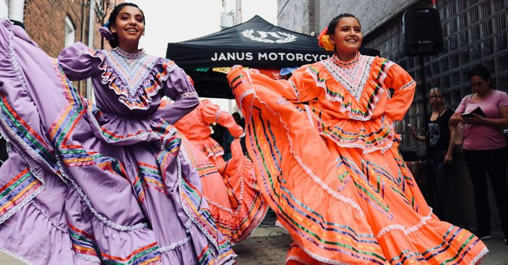 women in street dancing
Photo by
women in street dancing
Photo by  man and woman standing in front of louver door
Photo by
man and woman standing in front of louver door
Photo by  man in black t-shirt holding coca cola bottle
Photo by
man in black t-shirt holding coca cola bottle
Photo by  red and white coca cola signage
Photo by
red and white coca cola signage
Photo by  man holding luggage photo
Photo by
man holding luggage photo
Photo by  topless boy in blue denim jeans riding red bicycle during daytime
Photo by
topless boy in blue denim jeans riding red bicycle during daytime
Photo by  trust spelled with wooden letter blocks on a table
Photo by
trust spelled with wooden letter blocks on a table
Photo by  Everyone is Welcome signage
Photo by
Everyone is Welcome signage
Photo by  man with cap and background with red and pink wall l
Photo by
man with cap and background with red and pink wall l
Photo by  difficult roads lead to beautiful destinations desk decor
Photo by
difficult roads lead to beautiful destinations desk decor
Photo by  photography of woman pointing her finger near an man
Photo by
photography of woman pointing her finger near an man
Photo by  closeup photography of woman smiling
Photo by
closeup photography of woman smiling
Photo by  a man doing a trick on a skateboard
Photo by
a man doing a trick on a skateboard
Photo by  two men
  running man on bridge
Photo by
running man on bridge
Photo by  orange white and black bag
Photo by
orange white and black bag
Photo by  girl sitting on gray rocks
Photo by
girl sitting on gray rocks
Photo by  assorted-color painted wall with painting materials
Photo by
assorted-color painted wall with painting materials
Photo by  three women sitting on brown wooden bench
Photo by
three women sitting on brown wooden bench
Photo by 
 Photo by
  Photo by
  Photo by
  Photo by


 people sitting on chair in front of computer


